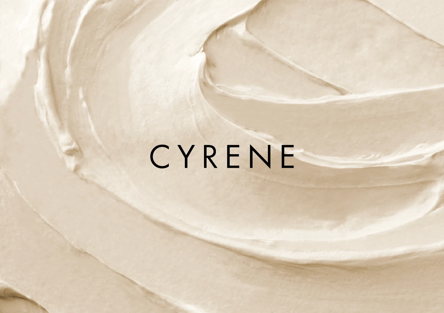
THE IDEA
Clean skincare branding has become trapped in its own formula. Pale neutrals. Soft wellness language. Nature packaged so delicately it disappears entirely. Cyrene approached the category differently, creating a brand that felt calm without becoming passive and bold without losing restraint.
We partnered with Cyrene to build a world rooted in contrast. Nature and precision. Softness and edge. Skincare designed to feel as good for the earth as it does on the skin.
Our Role
Brand Strategy
Brand Identity
Digital Experience
Portfolio Positioning
Industry
Beauty & Skincare
Cyrene
Skincare has become visually sterile. Endless soft neutrals, clinical promises, and branding so minimal it disappears entirely. Cyrene set out to create something with more tension, pairing conscious formulations with a darker, more editorial point of view. We partnered with the brand to build an identity system that feels calm but commanding, grounded in nature while confidently standing apart from the conventions of clean beauty.
CASE STUDY
Cyrene
Brand Strategy
Brand Identity
Creative Direction
Campaigns
Our Role
Beauty & Skincare
Industry
CASE STUDY
Skincare has become visually sterile. Endless soft neutrals, clinical promises, and branding so minimal it disappears entirely. Cyrene set out to create something with more tension, pairing conscious formulations with a darker, more editorial point of view. We partnered with the brand to build an identity system that feels calm but commanding, grounded in nature while confidently standing apart from the conventions of clean beauty.
BRAND SYSTEM
The identity lives in tension. Sharp typography sits against organic textures. Black and white palettes interrupt the expected visual language of clean beauty. Every detail was designed to feel stripped back, intentional, and quietly disruptive within a category obsessed with sameness.
THE IDEA
Clean skincare branding has become trapped in its own formula. Pale neutrals. Soft wellness language. Nature packaged so delicately it disappears entirely. Cyrene approached the category differently, creating a brand that felt calm without becoming passive and bold without losing restraint.
We partnered with Cyrene to build a world rooted in contrast. Nature and precision. Softness and edge. Skincare designed to feel as good for the earth as it does on the skin.
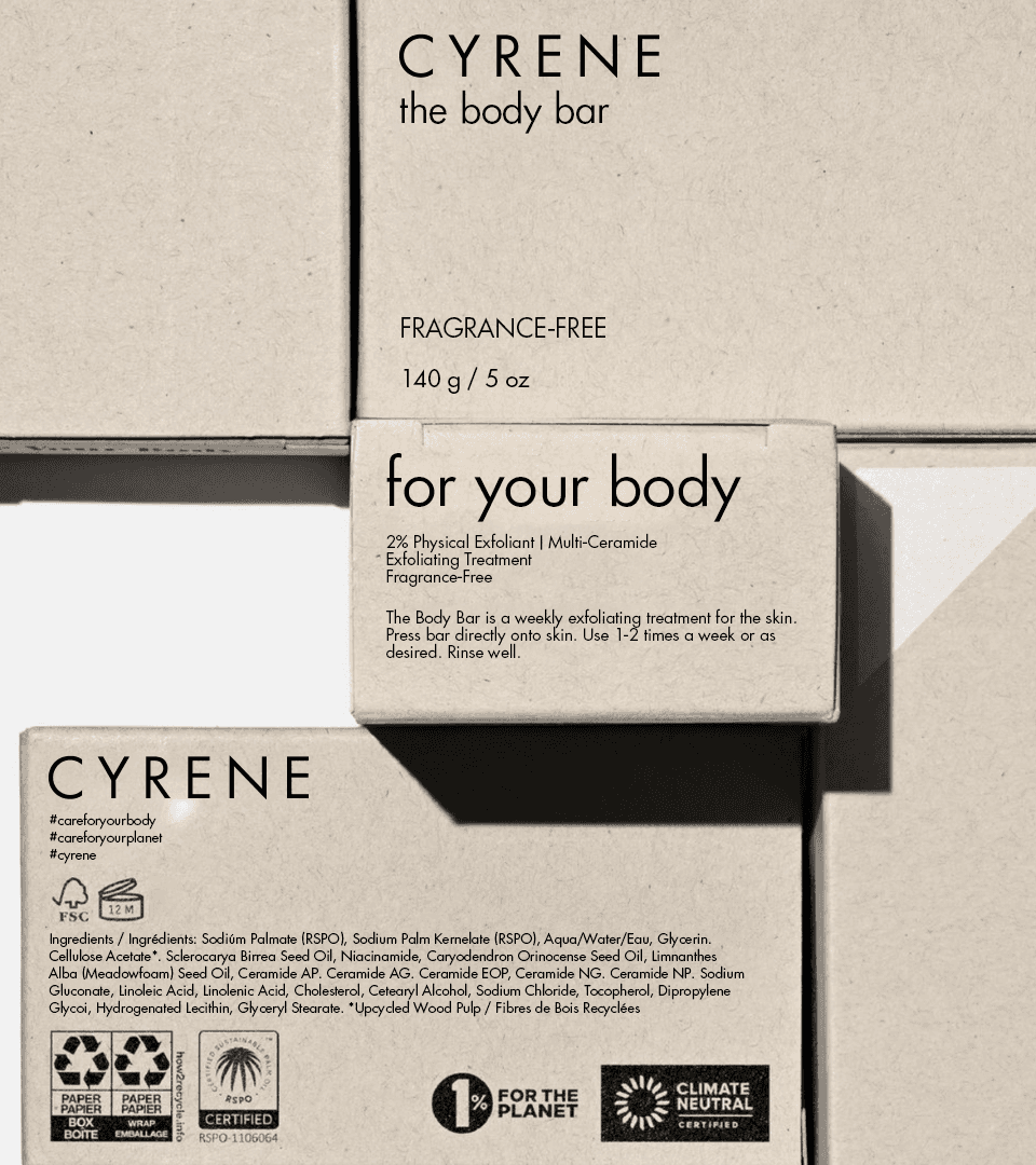
PACKAGING
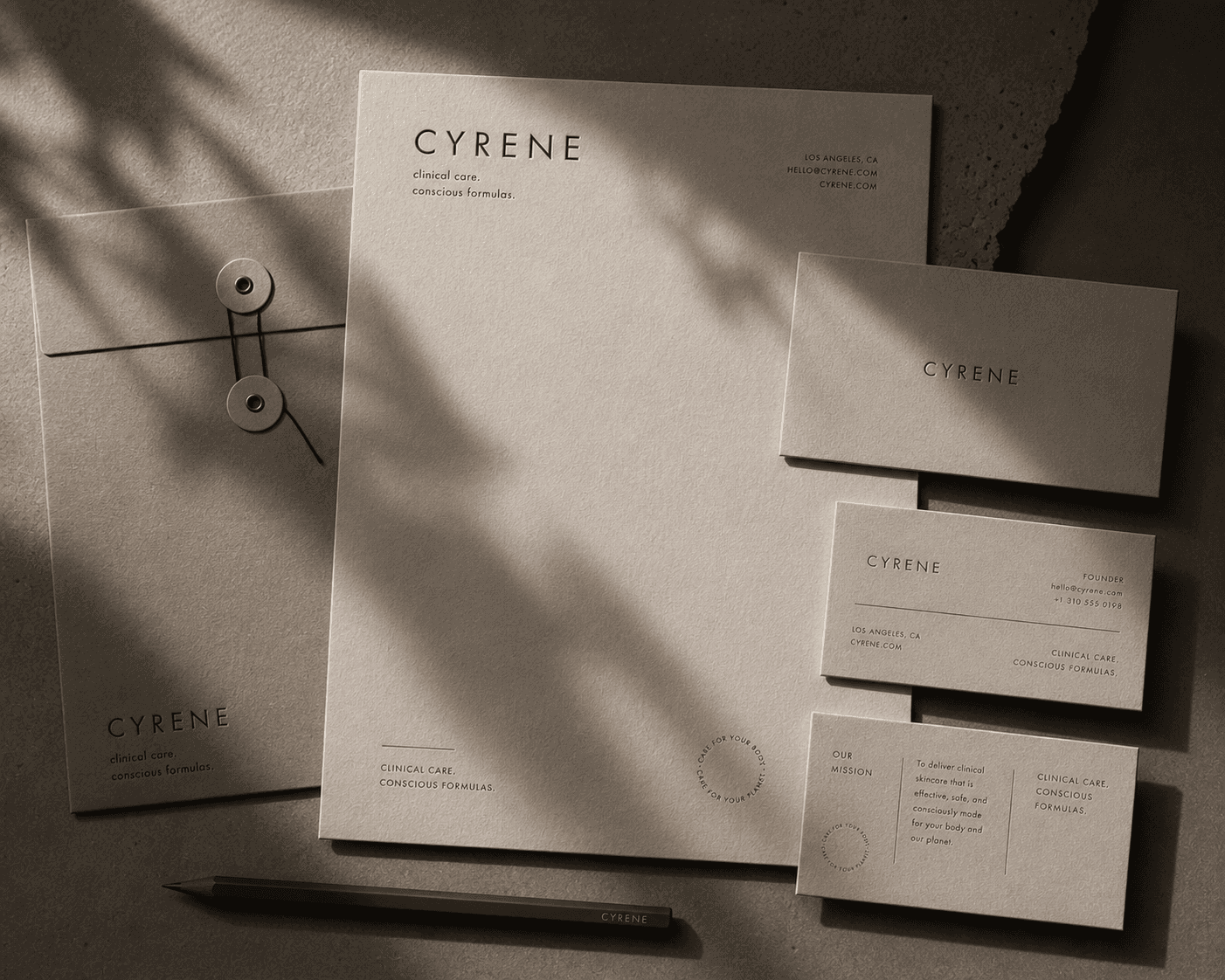
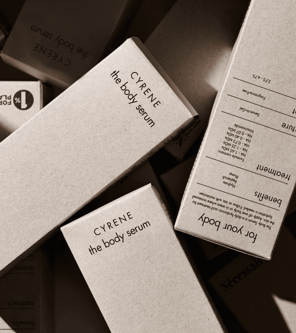
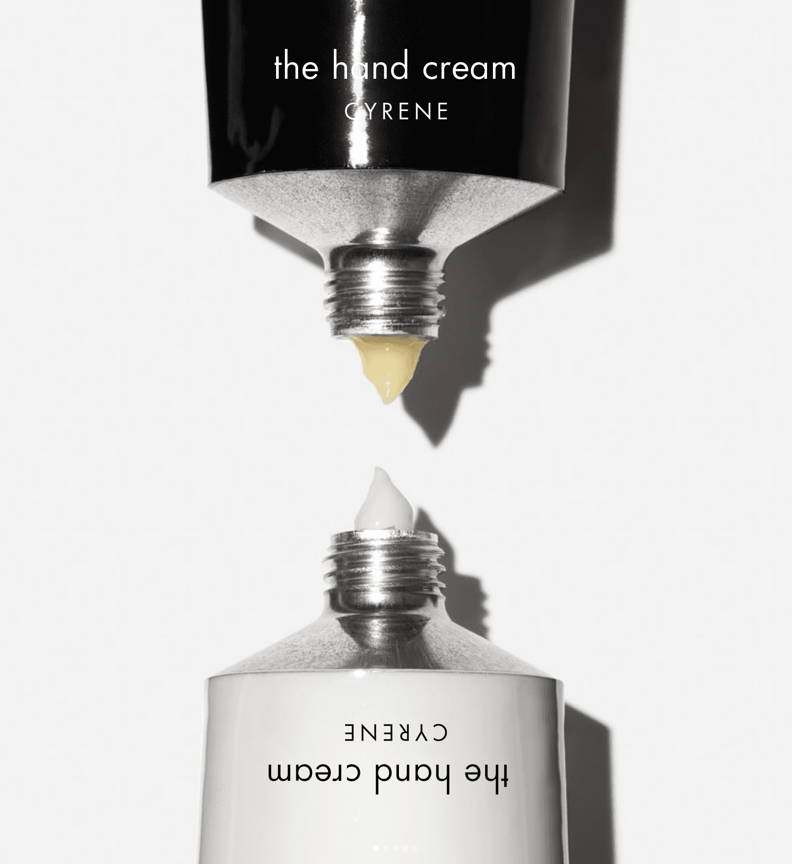
The packaging rejects the overdesigned aesthetic that dominates modern skincare. Minimal structures, tactile materials, and restrained compositions create a system that feels elevated without excess.
Nothing feels decorative for the sake of decoration. Every element earns its place.
BRAND SYSTEM
The identity lives in tension. Sharp typography sits against organic textures. Black and white palettes interrupt the expected visual language of clean beauty. Every detail was designed to feel stripped back, intentional, and quietly disruptive within a category obsessed with sameness.
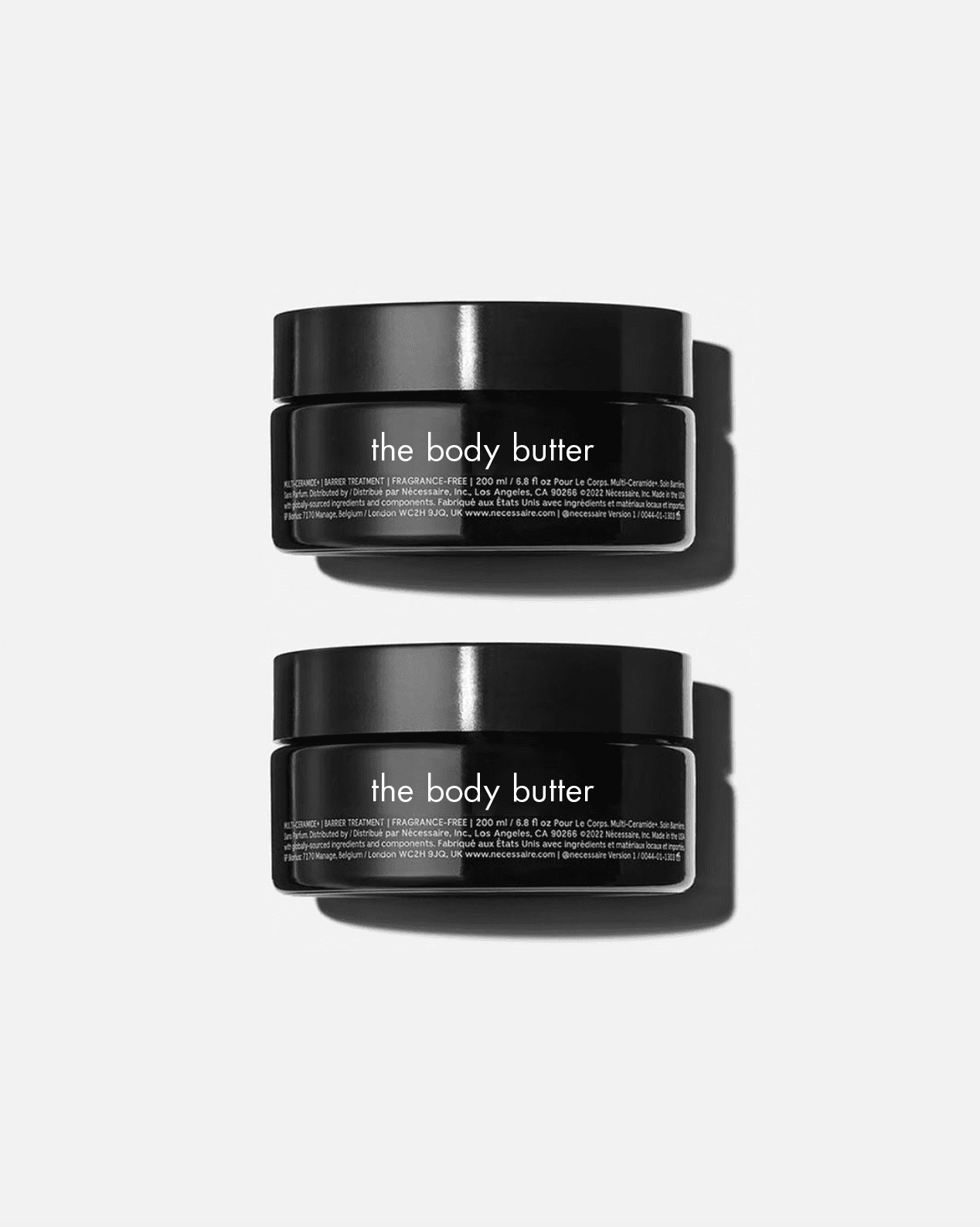
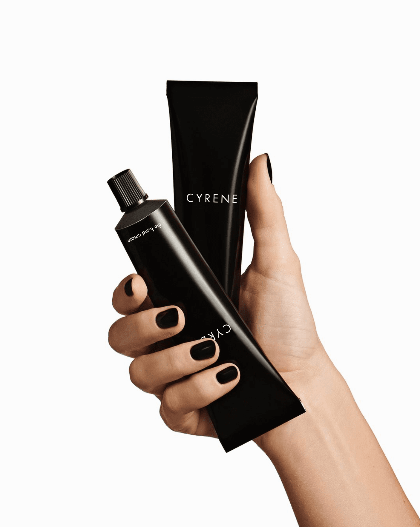
PRODUCT
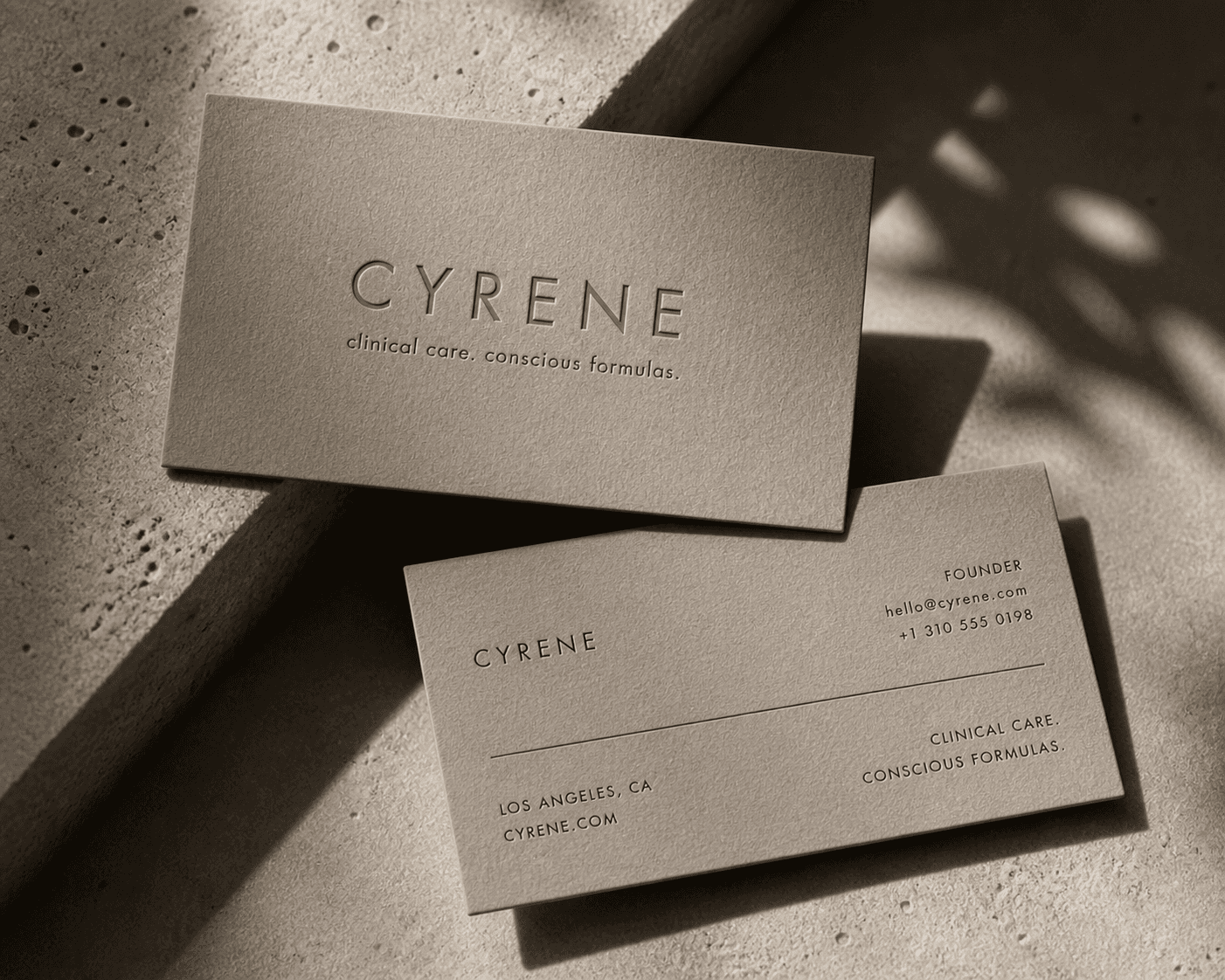
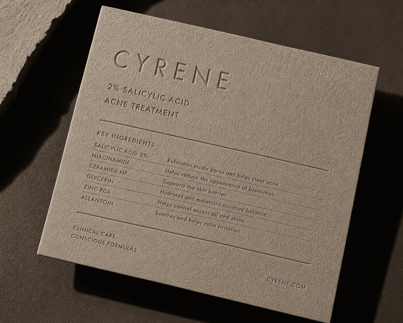
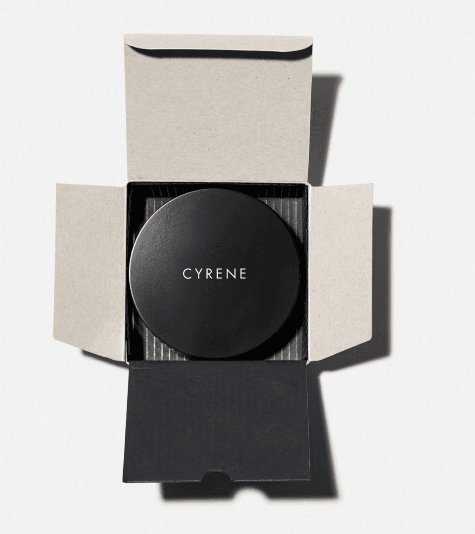
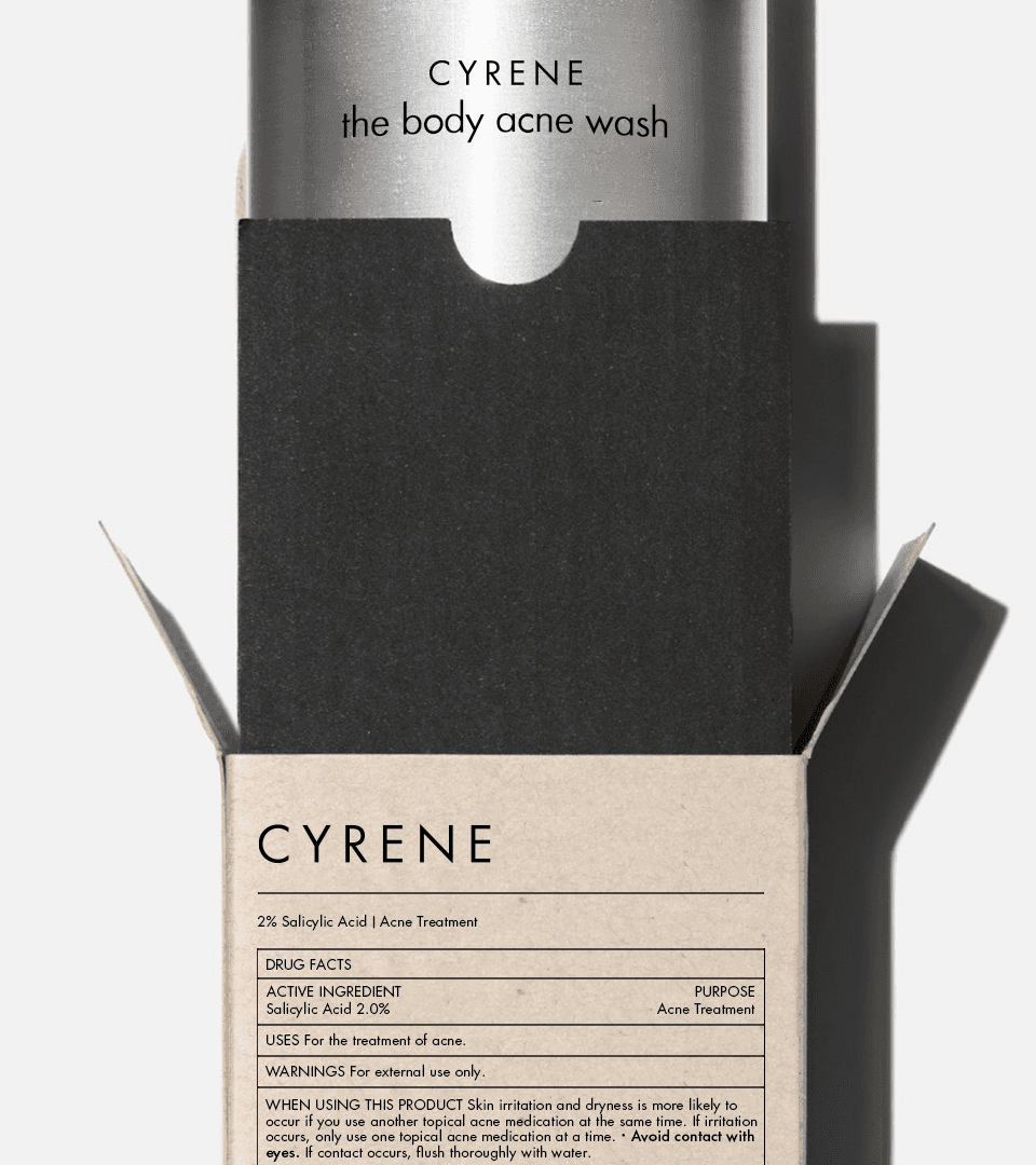
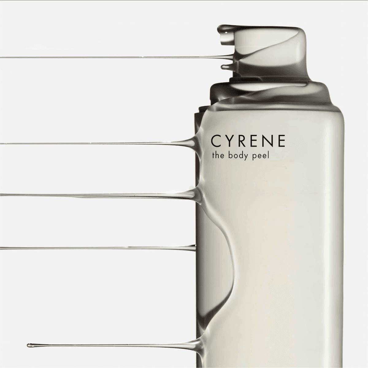
The products themselves became part of the identity system. Matte black finishes, understated labeling, and architectural forms helped position Cyrene closer to an object of design than traditional wellness packaging.
Simple. Functional. Sharp enough to leave out on purpose.
PACKAGING
The packaging rejects the overdesigned aesthetic that dominates modern skincare. Minimal structures, tactile materials, and restrained compositions create a system that feels elevated without excess.
Nothing feels decorative for the sake of decoration. Every element earns its place.


TEXTURE
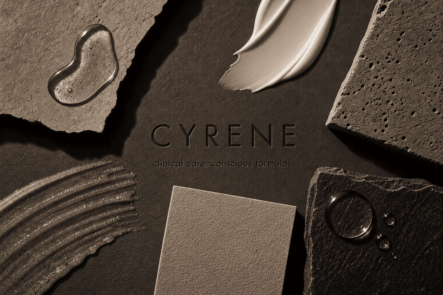
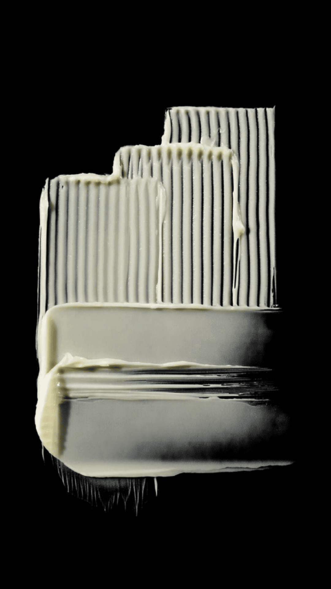
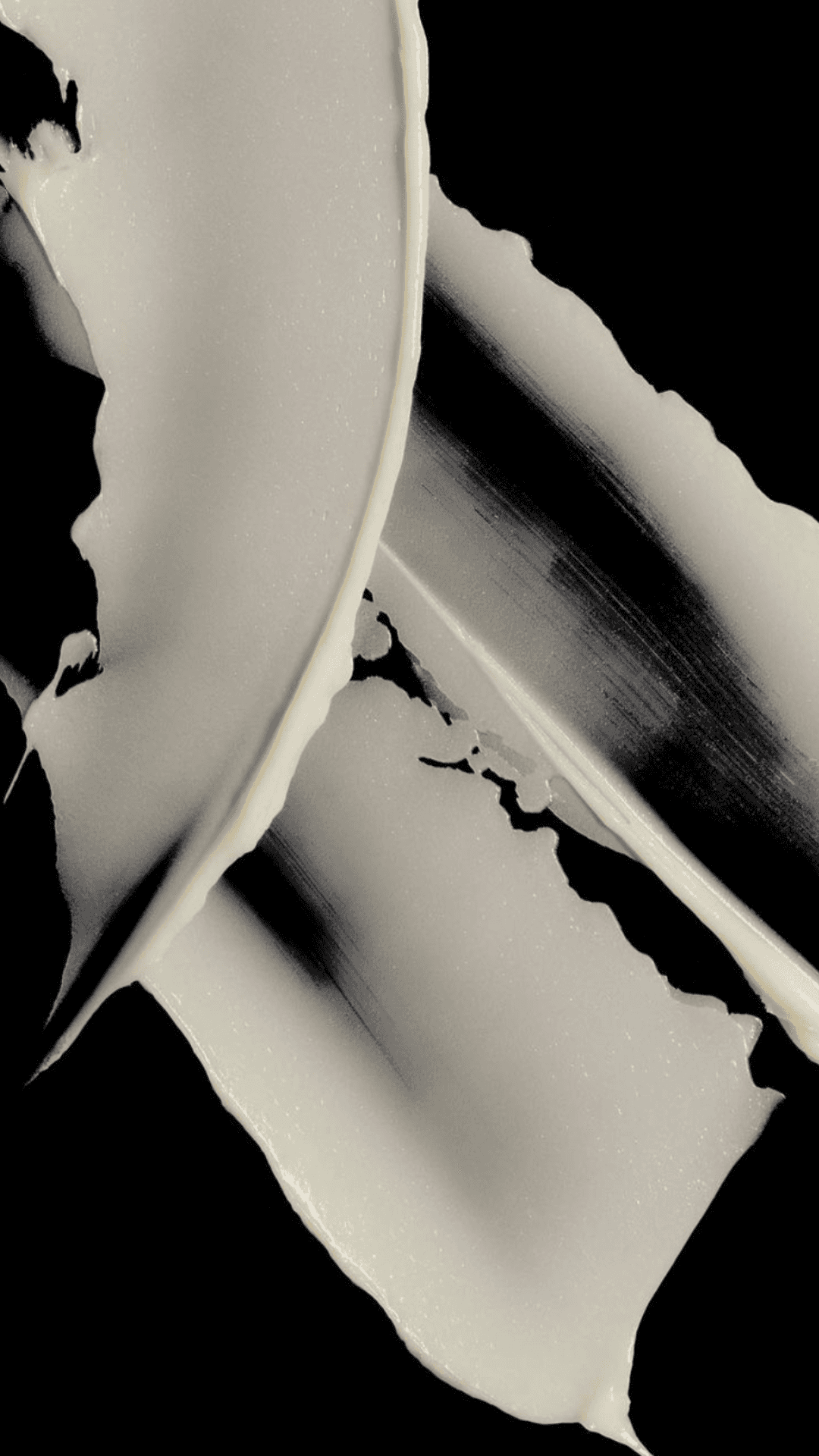
Texture became a defining part of the brand world. Skin, stone, paper, water, shadows. The visual language constantly moves between raw natural elements and refined minimalism, creating a tension that gives the brand its edge.
PRODUCT
The products themselves became part of the identity system. Matte black finishes, understated labeling, and architectural forms helped position Cyrene closer to an object of design than traditional wellness packaging.
Simple. Functional. Sharp enough to leave out on purpose.
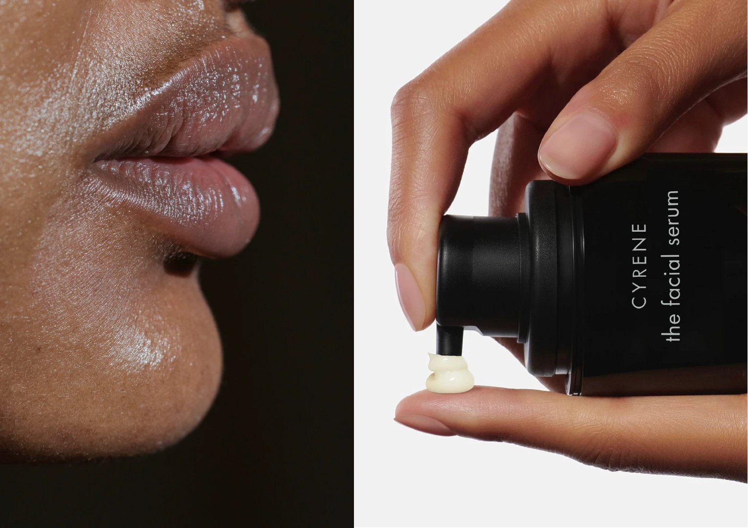
DIGITAL
Digital extended the restraint of the identity into motion. Editorial pacing, stark contrast, and immersive product imagery created an experience that feels less like browsing skincare and more like stepping into a carefully controlled atmosphere.
TEXTURES
Texture became a defining part of the brand world. Skin, stone, paper, water, shadows. The visual language constantly moves between raw natural elements and refined minimalism, creating a tension that gives the brand its edge.

CREATIVE DIRECTION
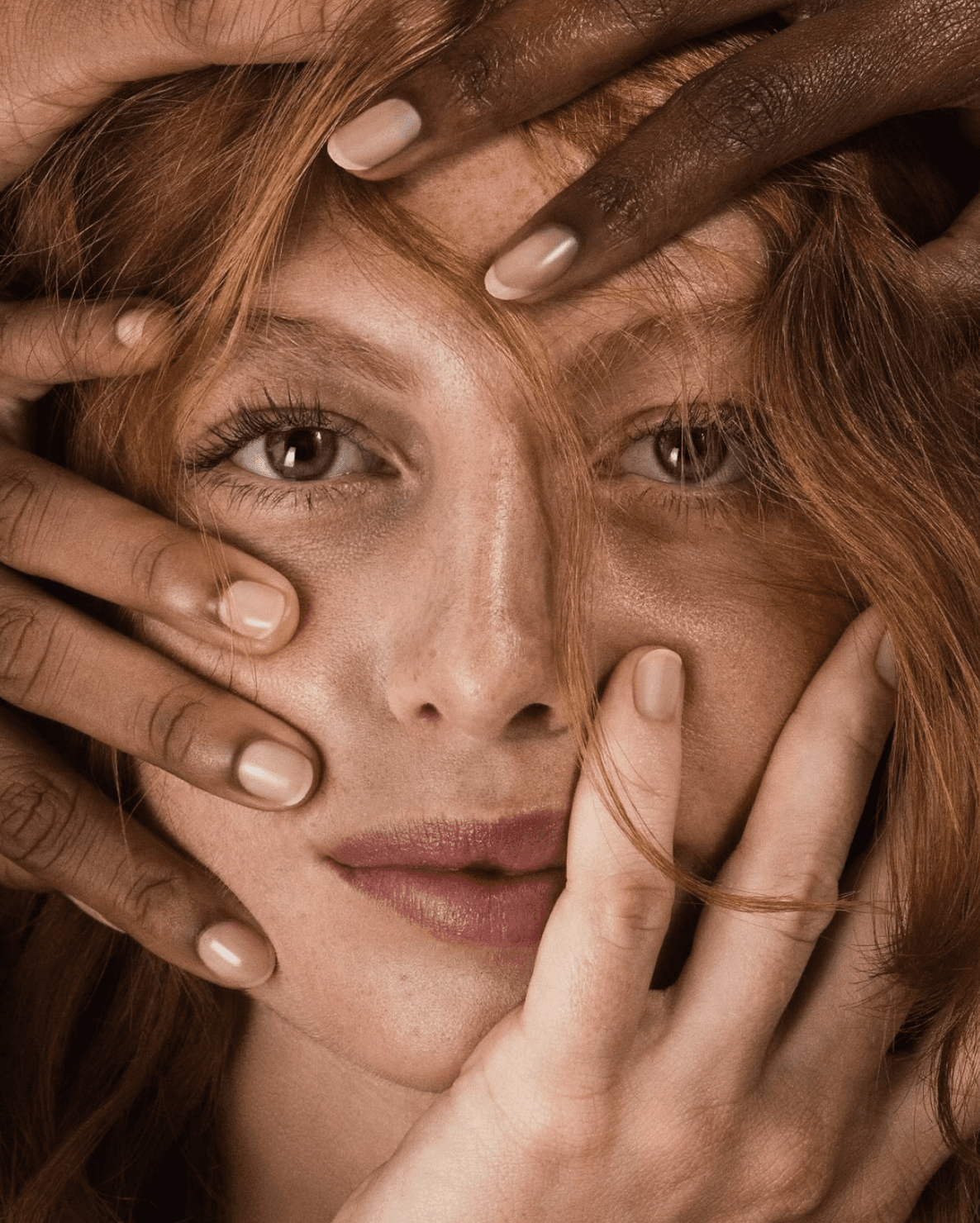
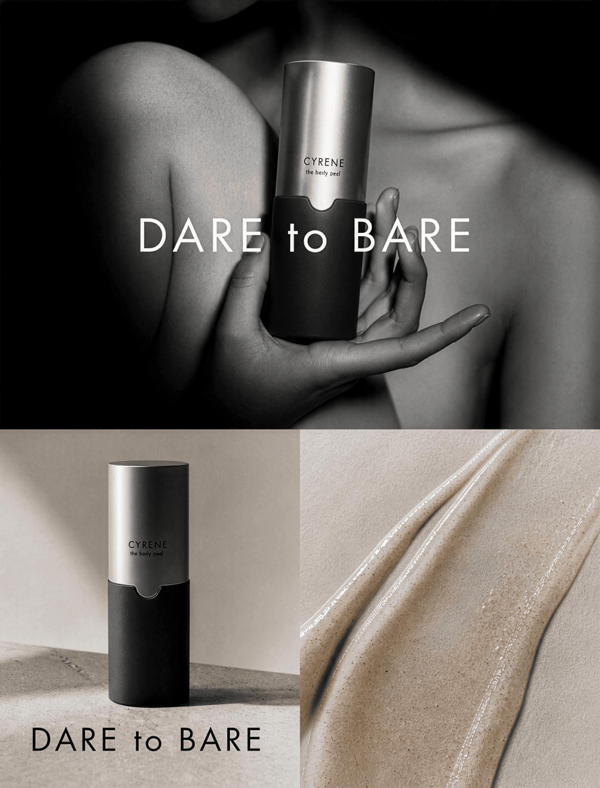
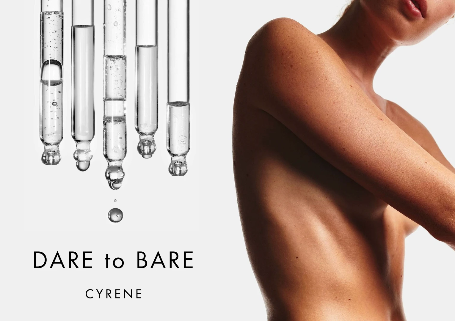
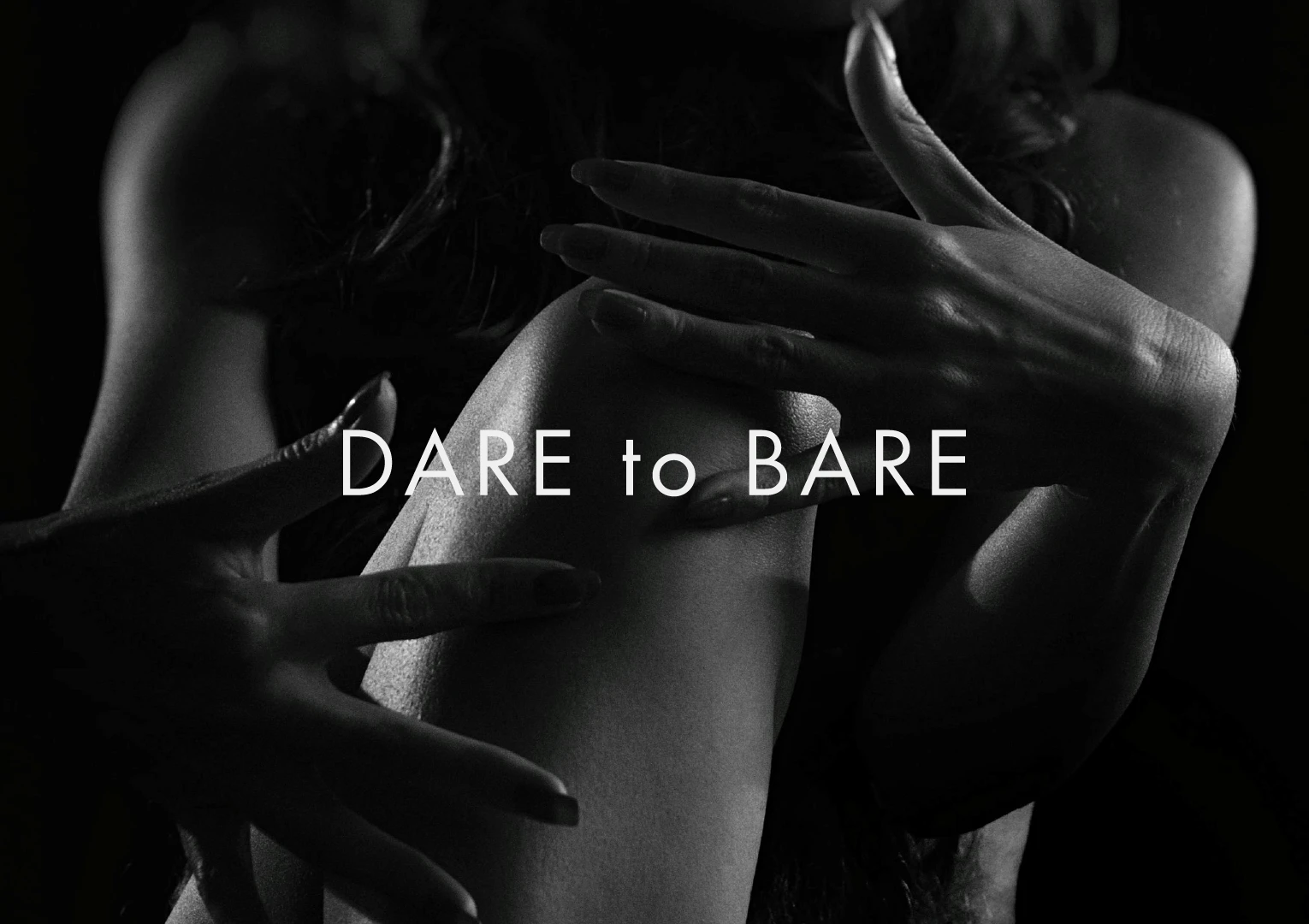
The creative direction explored the tension between exposure and restraint. Bare skin, hard shadows, scientific references, and sculptural compositions created a visual world that feels both intimate and confrontational.
DIGITAL
Digital extended the restraint of the identity into motion. Editorial pacing, stark contrast, and immersive product imagery created an experience that feels less like browsing skincare and more like stepping into a carefully controlled atmosphere.



THE OUTCOME
Cyrene entered the market with a presence that immediately cut through the noise of clean beauty branding. What emerged was a skincare brand that feels calm but unforgettable, proving sustainability and restraint don’t have to come at the expense of personality or edge.
CREATIVE DIRECTION
The creative direction explored the tension between exposure and restraint. Bare skin, hard shadows, scientific references, and sculptural compositions created a visual world that feels both intimate and confrontational.
Less “clean girl” skincare. More skin as texture, ritual, and identity.
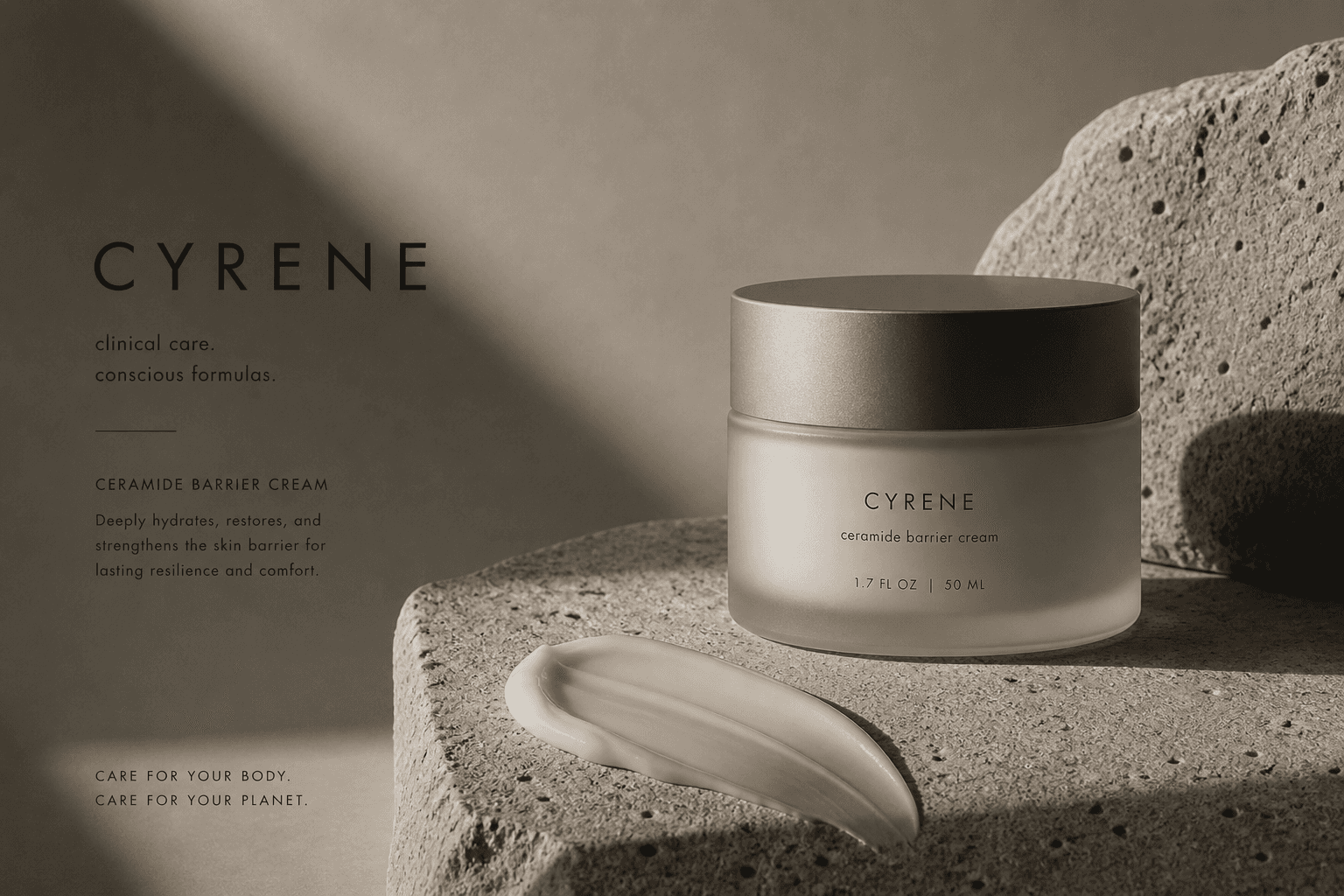
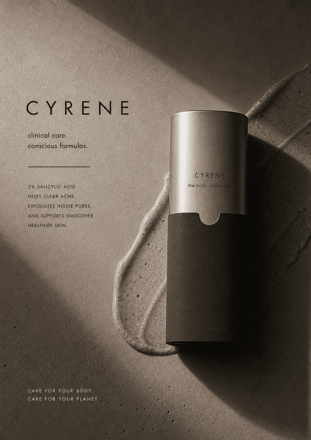
The campaign direction challenged the overly polished language of modern skincare advertising. Stark lighting, exposed skin, scientific textures, and the “Dare to Bare” platform created a visual world that felt raw, confident, and intentionally stripped back.
Rather than selling perfection, the campaigns celebrated skin as something real, tactile, and deeply human.
APPLICATIONS
THE OUTCOME
Cyrene entered the market with a presence that immediately cut through the noise of clean beauty branding. What emerged was a skincare brand that feels calm but unforgettable, proving sustainability and restraint don’t have to come at the expense of personality or edge.