Our Role
Brand Strategy
Brand Identity
Digital Experience
Launch & Growth
Industry
Experiential Events
Pickleball Party Planner
Pickleball is exploding, but most brands feel temporary and informal. Pickleball Party Planner set out to elevate the game into a curated social experience. We built a brand that blends sport, hospitality, and design—creating a flexible system designed to live seamlessly across environments, from courts to digital.
Industry
Experiential Events
Brand Strategy
Brand Identity
Digital Experience
Launch & Growth
Our Role
CASE STUDY
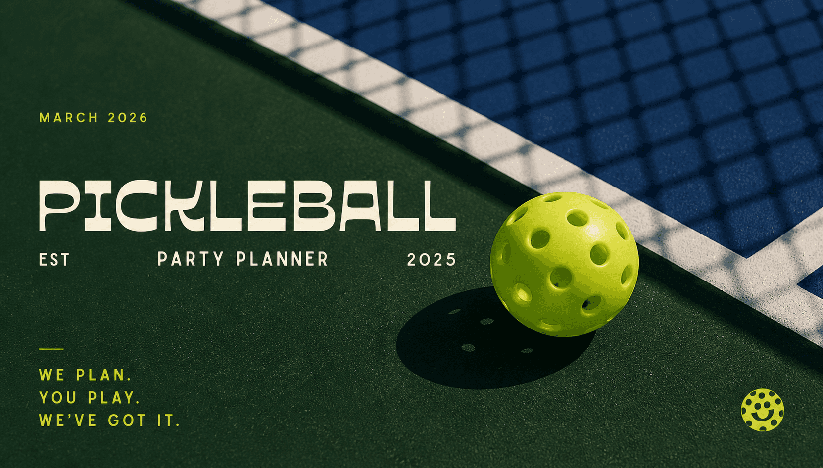
As pickleball has rapidly grown from a casual pastime into a cultural and social phenomenon, the surrounding brand landscape has struggled to keep pace. Many experiences feel informal, inconsistent, and visually fragmented, lacking the structure and intention expected of a modern hospitality-driven brand. Pickleball Party Planner set out to change that, building a brand that elevates the game into a curated social experience and brings consistency, and energy to an increasingly crowded and evolving space.
THE IDEA
As pickleball has rapidly grown from a casual pastime into a cultural and social phenomenon,
the surrounding brand landscape has struggled to keep pace. Many experiences feel informal, inconsistent, and visually fragmented, lacking the structure and intention expected of a modern hospitality-driven brand. Pickleball Party Planner set out to change that, building a brand that elevates the game into a curated social experience and brings consistency, and energy to an increasingly crowded and evolving space.
OUR APPROACH
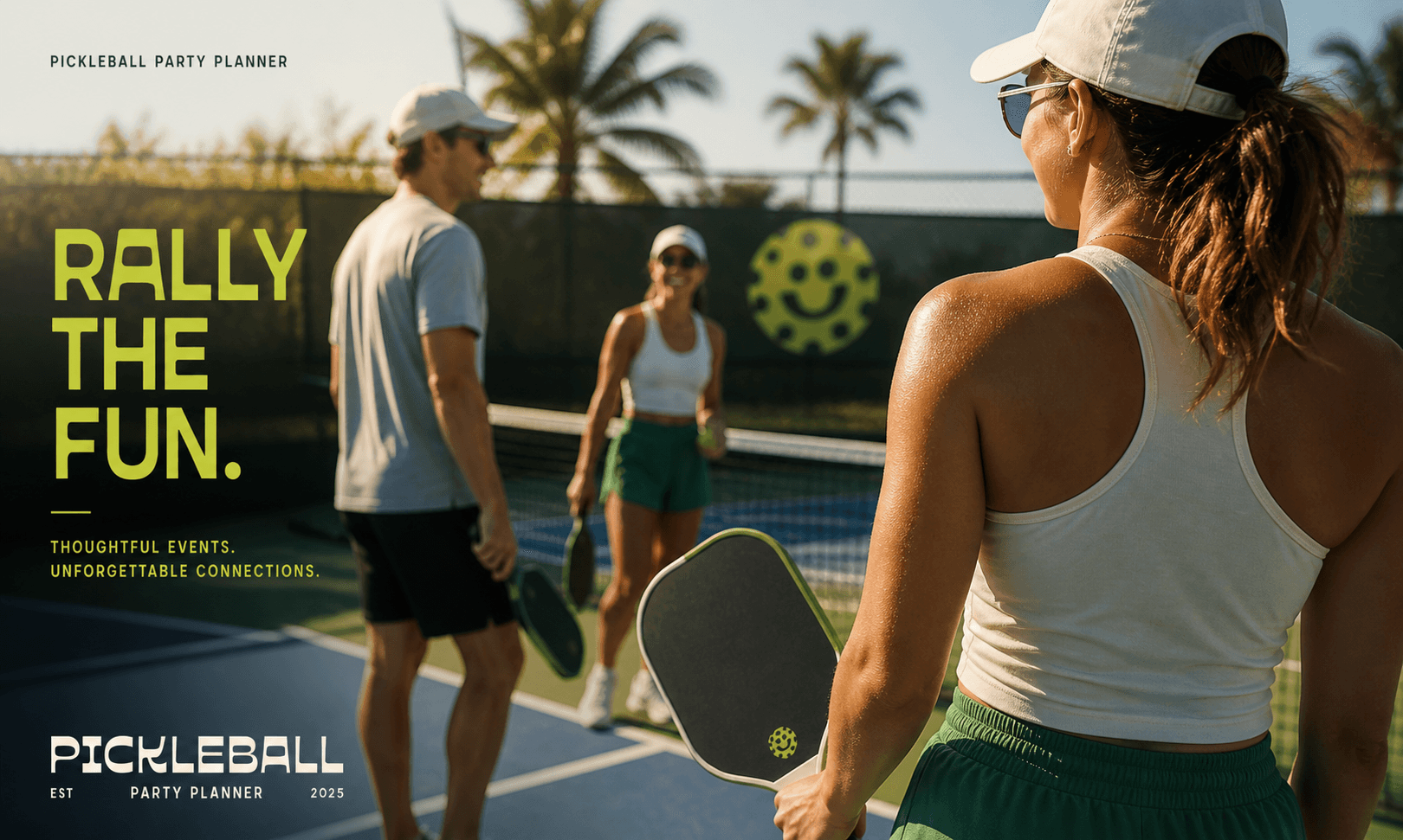
We approached the brand as an experience first, not just a visual identity. The goal was to balance energy with structure, creating a system that feels social and expressive while remaining consistent across touchpoints. Through a bold typographic voice, a flexible color system, and a distinctive graphic language, we built an identity designed to move seamlessly between environments, from courts and events to digital platforms, ensuring the brand feels cohesive, recognizable, and built to scale.
We approached the brand as an experience first, not just a visual identity. The goal was to balance energy with structure, creating a system that feels social and expressive while remaining consistent across touchpoints. Through a bold typographic voice, a flexible color system, and a distinctive graphic language, we built an identity designed to move seamlessly between environments, from courts and events to digital platforms, ensuring the brand feels cohesive, recognizable, and built to scale.


BRAND SYSTEM
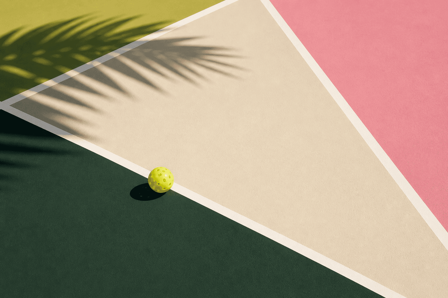
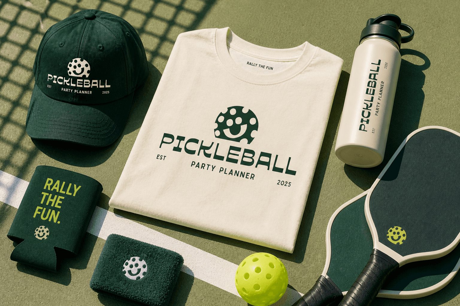
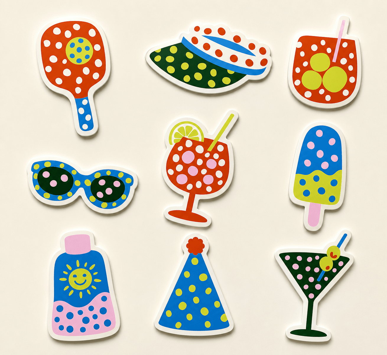
The brand system was built to be bold, flexible, and instantly recognizable. A strong typographic foundation is paired with a vibrant, expressive color palette and a distinctive icon that anchors the identity across applications. Graphic elements are designed to scale from subtle accents to dominant moments, allowing the brand to adapt across environments while maintaining consistency. The result is a cohesive system that feels both playful and structured, supporting everything from large-scale experiences to detailed touchpoints.
THE EXPERIENCE
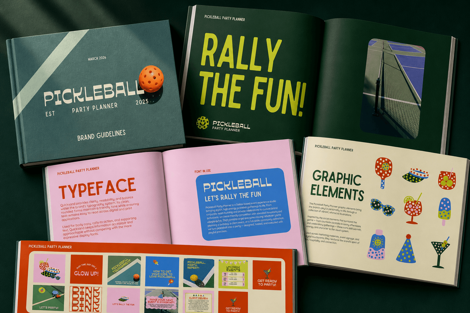
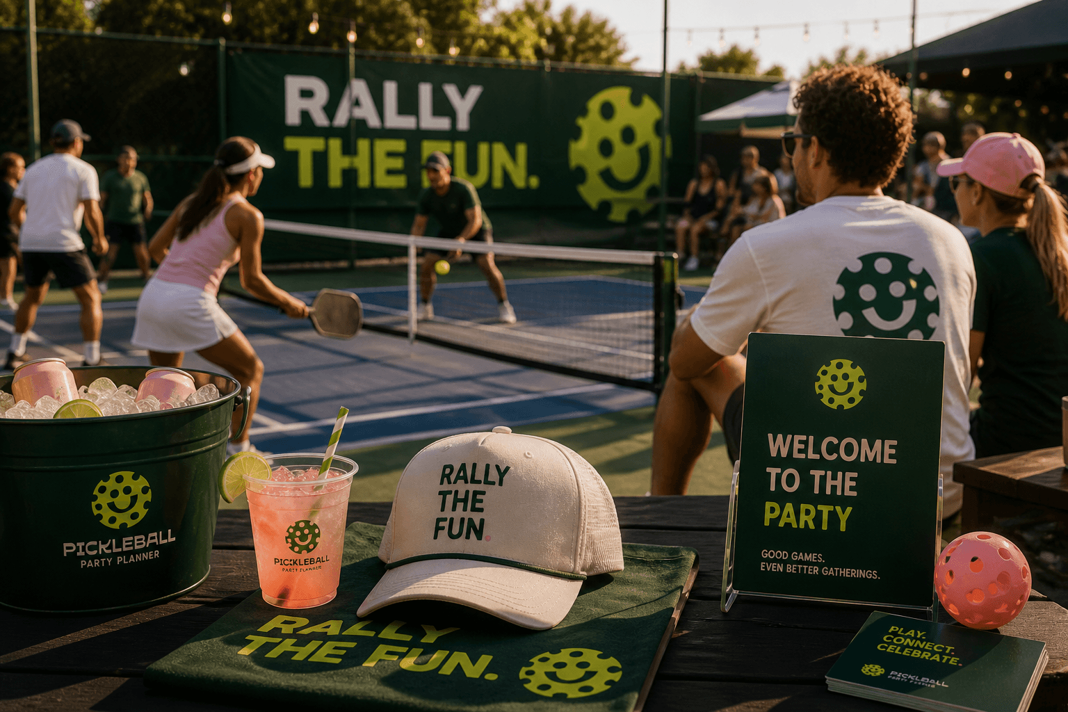
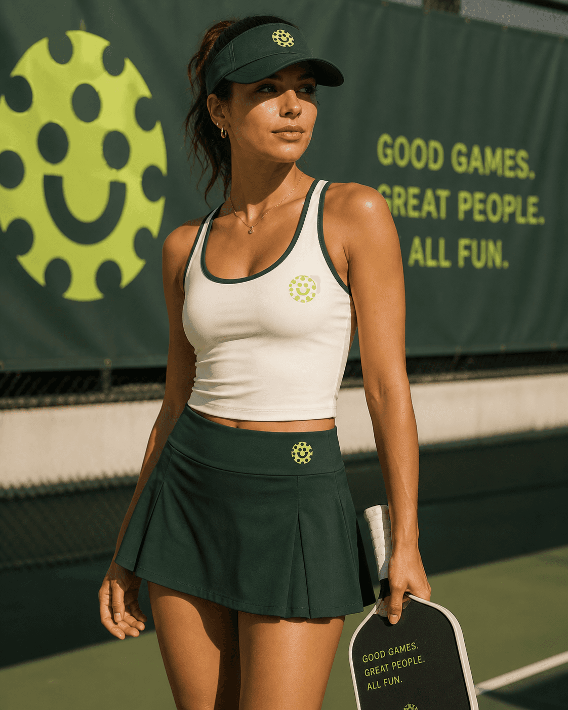
The brand was designed to live beyond the logo, taking shape in real environments and live events. From courtside details to large-scale setups, every touchpoint was considered to create a cohesive and engaging atmosphere. Signage, materials, and spatial moments work together to guide, inform, and energize, ensuring each experience feels intentional and aligned. The result is a brand that doesn’t just exist visually, but is felt through the moments it creates and the spaces it inhabits.

TACTILE
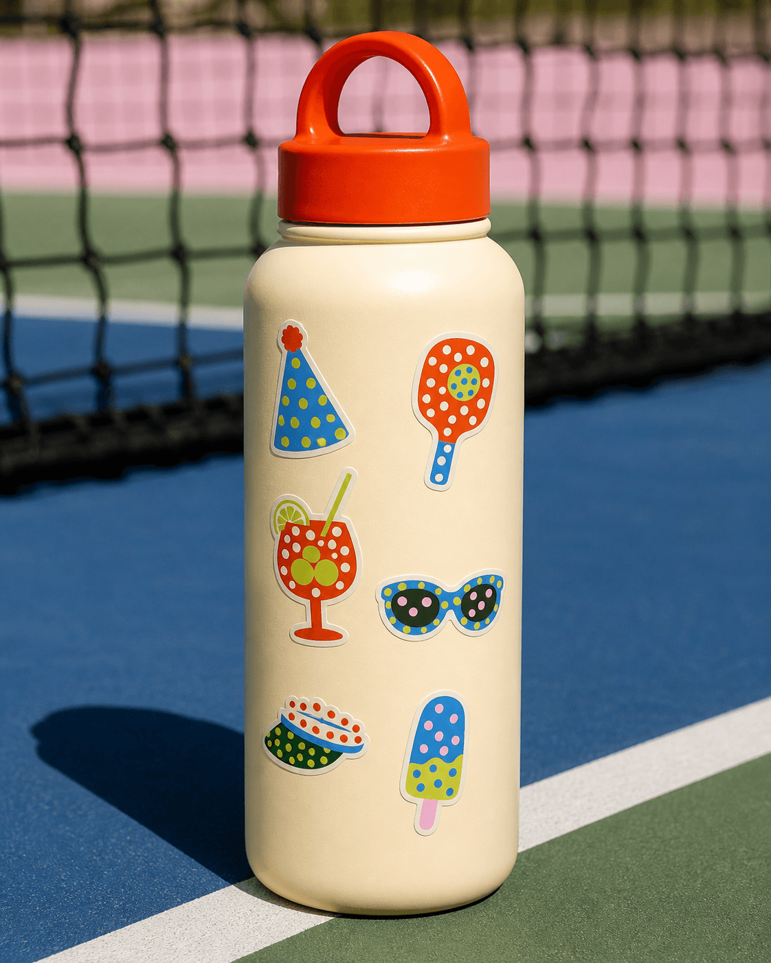
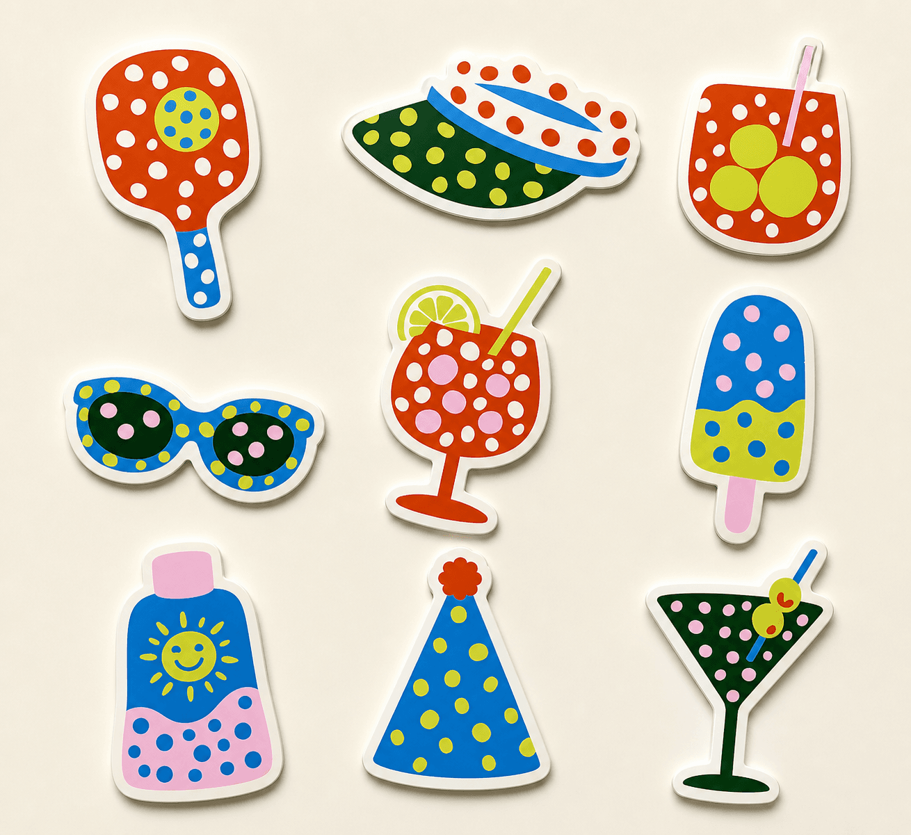
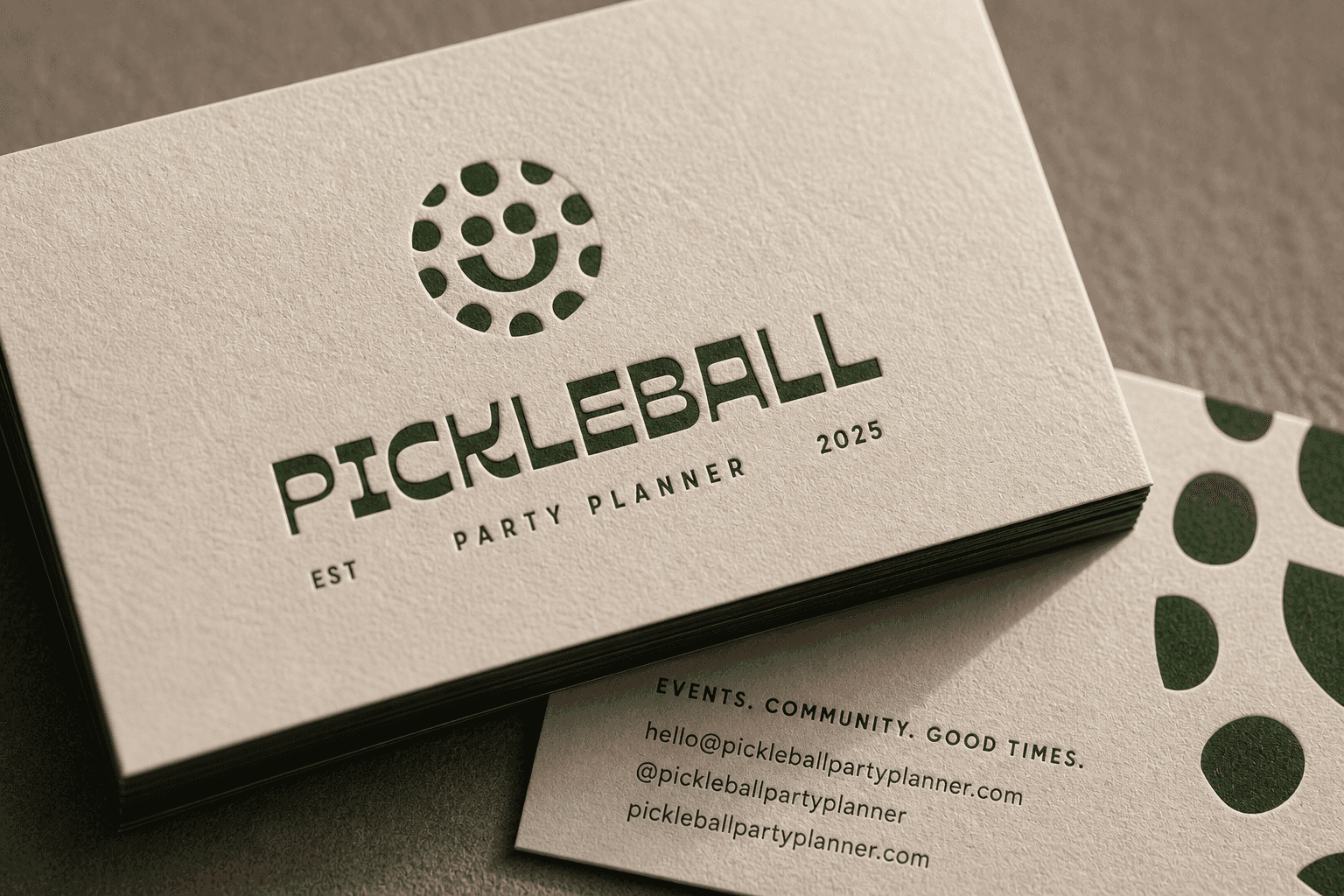
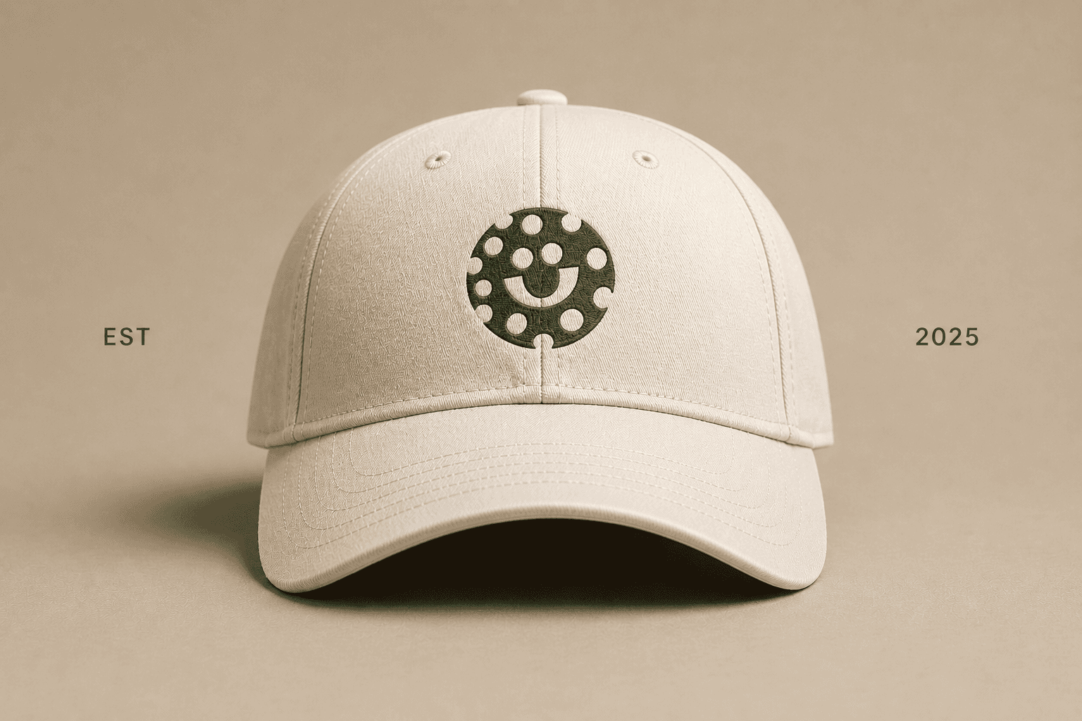
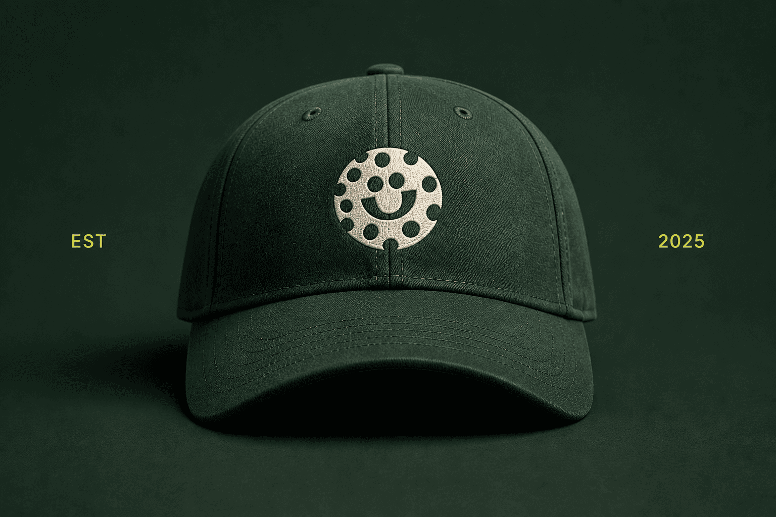
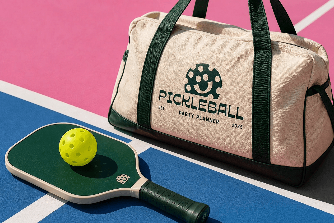
The tactile system translates the brand into physical form through considered materials and production. From print and stationery to apparel and event elements, each piece is designed to feel intentional in hand as well as on screen. Texture, scale, and finish play a key role, reinforcing the brand’s balance of playfulness and structure. The result is a cohesive set of touchpoints that extend the identity into the physical world with clarity and consistency.



DIGITAL
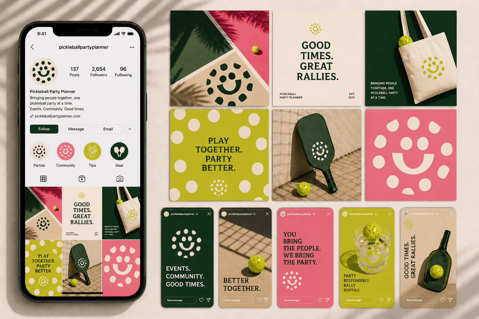
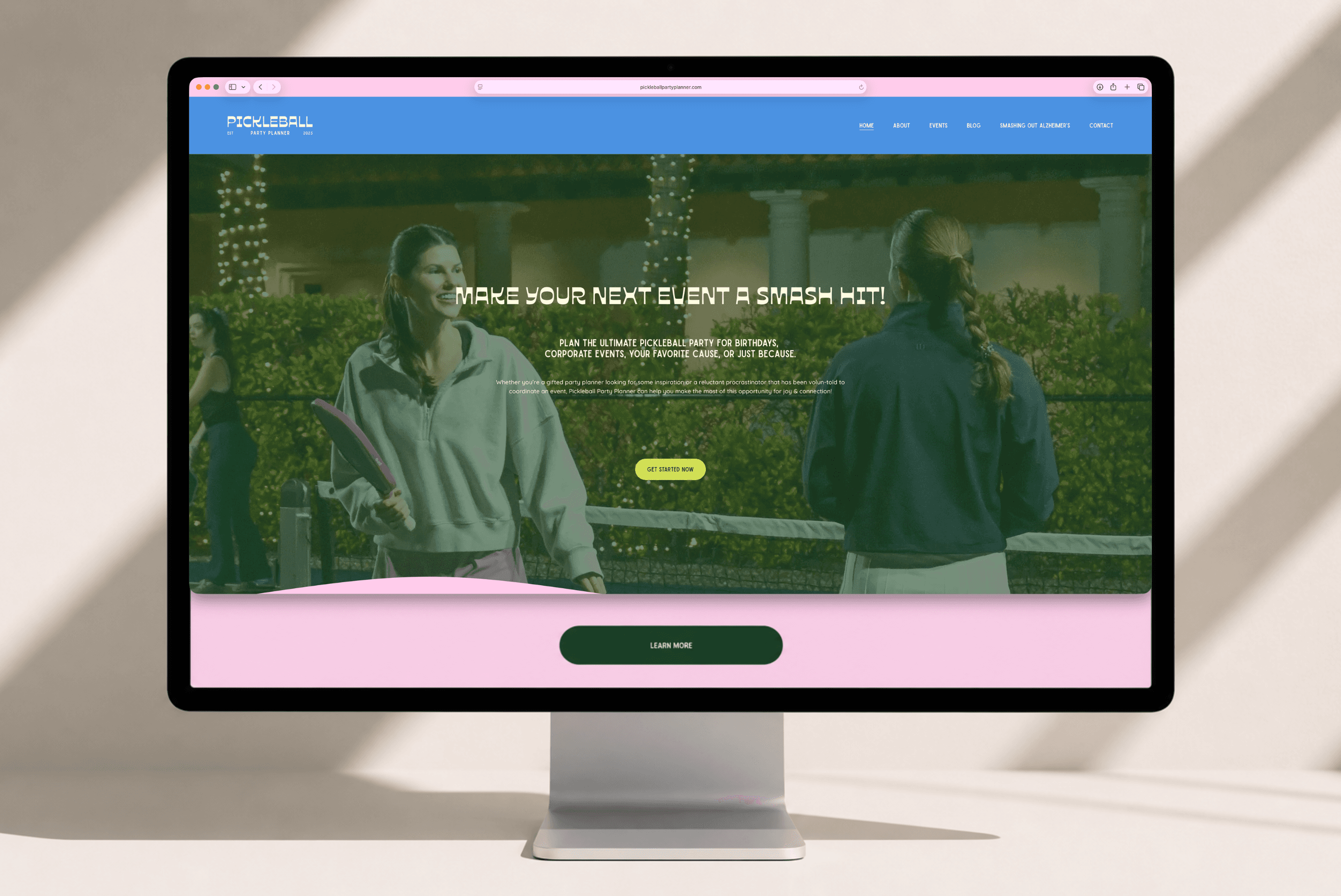
The digital system was built to support ongoing content and real-time storytelling. From social to web, the brand translates into a flexible framework that can adapt without losing its identity. Typography, color, and composition create a distinct rhythm across platforms, allowing each piece of content to feel connected while still evolving. The result is a digital presence that feels active, expressive, and built to move with the brand as it grows.
DIGITAL
The digital system was built to support ongoing content and real-time storytelling. From social to web, the brand translates into a flexible framework that can adapt without losing its identity. Typography, color, and composition create a distinct rhythm across platforms, allowing each piece of content to feel connected while still evolving. The result is a digital presence that feels active, expressive, and built to move with the brand as it grows.

“I'm so grateful to have had the opportunity to work with Parachute Studio! They helped take the creative chaos in my mind and turned it into a branding strategy perfectly aligned with how I wanted Pickleball Party Planner positioned in the market. I've already received so much positive feedback on the new branding! I can't recommend this talented team enough!”
"I'm so grateful to have had the opportunity to work with Parachute Studio! They helped take the creative chaos in my mind and turned it into a branding strategy perfectly aligned with how I wanted Pickleball Party Planner positioned in the market. I've already received so much positive feedback on the new branding! I can't recommend this talented team enough!”
Cecilia Hagan
Founder, Pickleball Party Planner
Cecilia Hagan
Founder, Pickleball Party Planner
BRAND SYSTEM
The brand system was built to be bold, flexible, and instantly recognizable. A strong typographic foundation is paired with a vibrant, expressive color palette and a distinctive icon that anchors the identity across applications. Graphic elements are designed to scale from subtle accents to dominant moments, allowing the brand to adapt across environments while maintaining consistency. The result is a cohesive system that feels both playful and structured, supporting everything from large-scale experiences to detailed touchpoints.
the EXPERIENCE
The brand was designed to live beyond the logo, taking shape in real environments and live events. From courtside details to large-scale setups, every touchpoint was considered to create a cohesive and engaging atmosphere. Signage, materials, and spatial moments work together to guide, inform, and energize, ensuring each experience feels intentional and aligned. The result is a brand that doesn’t just exist visually, but is felt through the moments it creates and the spaces it inhabits.
TACTILE
The tactile system translates the brand into physical form through considered materials and production. From print and stationery to apparel and event elements, each piece is designed to feel intentional in hand as well as on screen. Texture, scale, and finish play a key role, reinforcing the brand’s balance of playfulness and structure. The result is a cohesive set of touchpoints that extend the identity into the physical world with clarity and consistency.
THE OUTCOME
The result is a brand that feels as social and dynamic as the game itself, while introducing a level of intention and design rarely seen in the space. It moves seamlessly between environments, from courts and events to digital platforms, creating a cohesive presence that is both recognizable and adaptable. More than a visual identity, it establishes a foundation for the brand to grow, evolve, and define its place within a rapidly expanding culture.
The result is a brand that feels as social and dynamic as the game itself, while introducing a level of intention and design rarely seen in the space. It moves seamlessly between environments, from courts and events to digital platforms, creating a cohesive presence that is both recognizable and adaptable. More than a visual identity, it establishes a foundation for the brand to grow, evolve, and define its place within a rapidly expanding culture.
