Our Role
Brand Strategy
Digital Experience
Art Direction
Go-to-Market
Industry
Oil & Gas
Quinn Resources
Oil and gas branding has barely changed in forty years. Generic marks, conservative palettes, language that says nothing. Quinn Resources approached the category differently, building a firm rooted in long-term stewardship rather than transactional posture. We partnered with Quinn to create a brand and digital system designed to feel established from day one — the kind of presence that earns trust before the first conversation, in a category where credibility is the only currency that matters.
CASE STUDY
Quinn Resources
Brand Strategy
Art Direction
Digital Experience
Go-to-Market
Launch & Growth
Oil & Gas
Industry
CASE STUDY
Our Role
Launching without an established track record, Gray Capital needed a brand and digital presence that could immediately convey confidence, clarity, and long-term intent. In a category defined by credibility, even small gaps in perception can impact trust, decision-making, and growth. We partnered with Gray Capital to build a brand and digital system designed to communicate quiet confidence, reinforce trust, and position the firm as established from day one.

THE IDEA
We began by understanding the firm’s principles, its approach to investing, and the expectations of its audience. This revealed a clear gap between the strength of the business and how it was being presented. From there, we defined a brand direction designed to convey trust, clarity, and long-term intent. A modern expression of tradition, built to feel established from day one. Our focus extended beyond identity. We created a cohesive system designed to support digital, physical, and future growth. The result is a brand that communicates quiet confidence and credibility, aligning perception with the firm’s true position.
BRAND SYSTEM
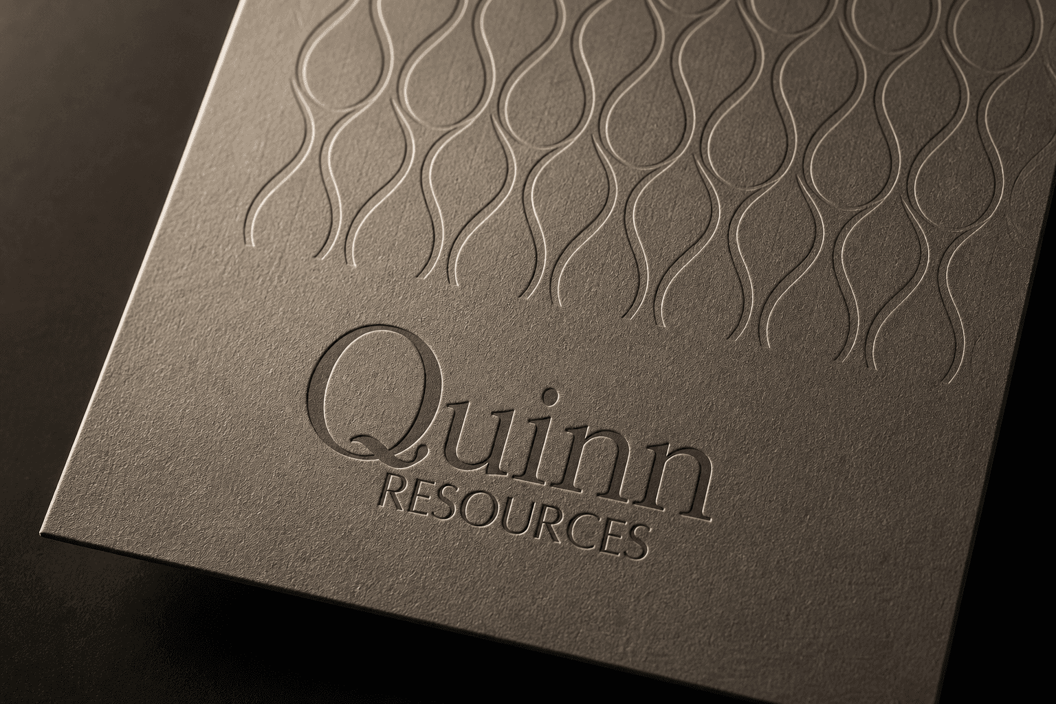
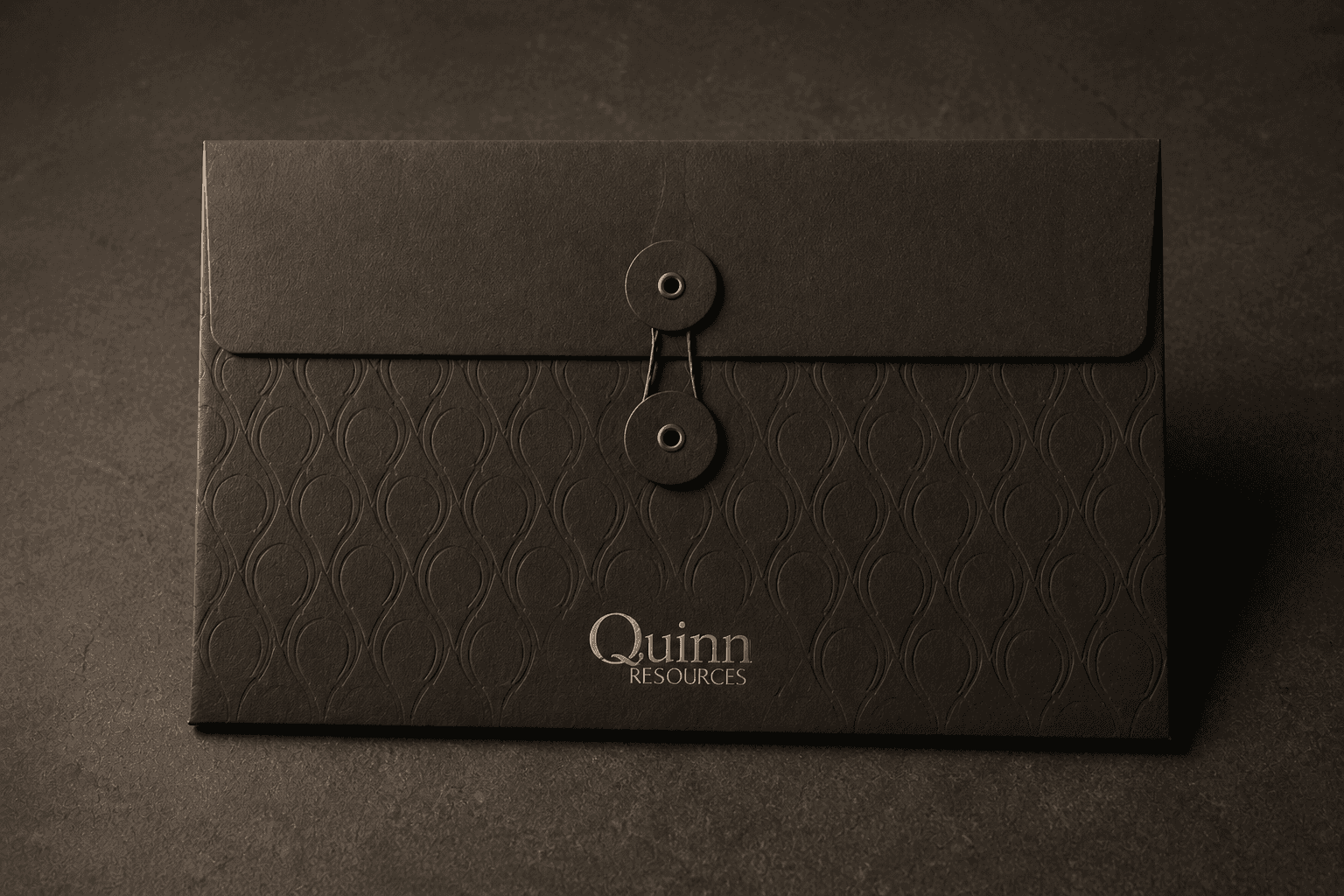
The system was built around restraint and precision. A refined typographic foundation anchors the identity, supported by a tightly controlled palette drawn from the land Quinn works rather than the industry's defaults. Graphic language is minimal and intentional — nothing decorative, nothing performative. Every element earns its place. The result is a system that reads stable, credible, and recognizable across the materials the firm actually uses, without slipping into the visual shorthand of the category.
APPLICATIONS
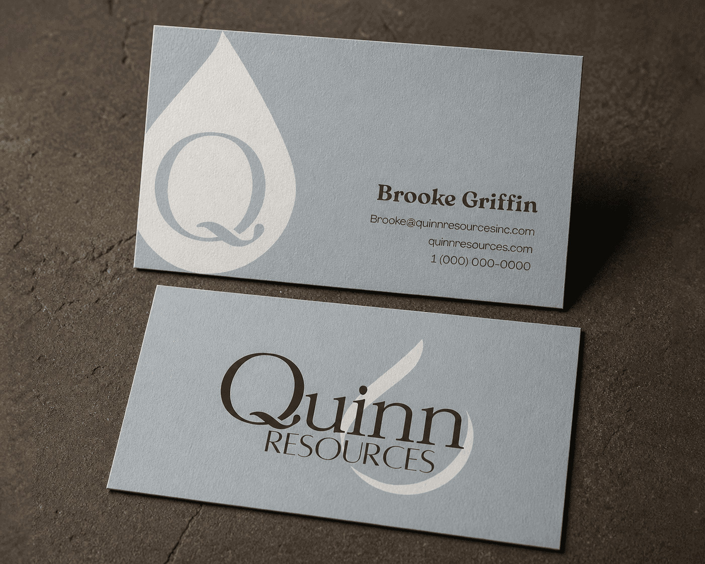
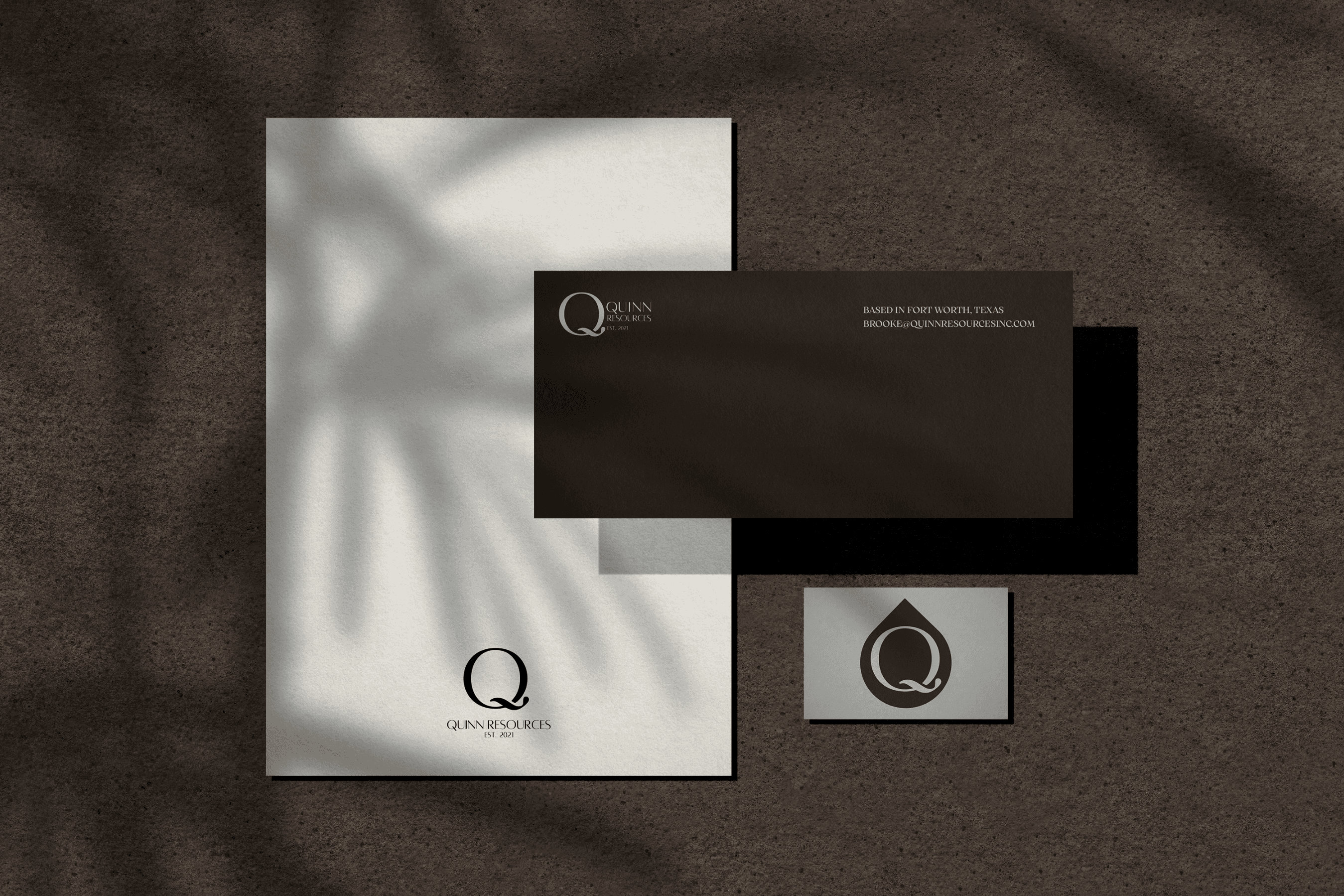
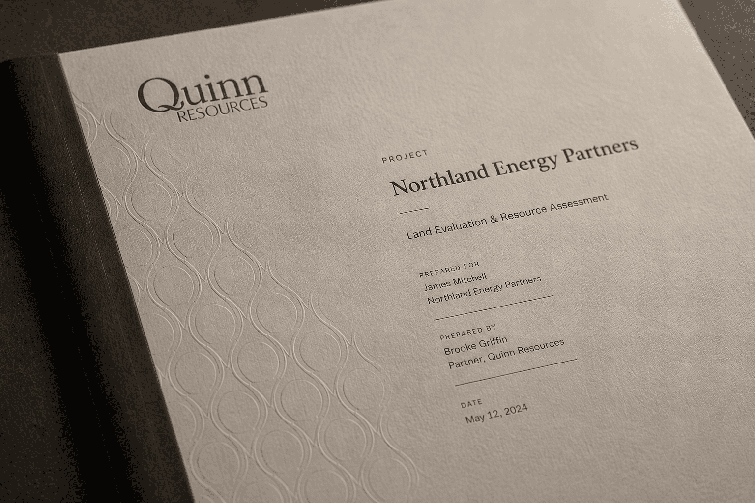
The brand was built to perform across the materials Quinn relies on day-to-day. Investor presentations, technical reports, field documents, signage, and digital touchpoints all carry the same level of consideration. The system holds its hierarchy and tone across formats without forcing uniformity, so every interaction with the firm — pitch deck or property report — feels deliberate, credible, and recognizably Quinn.
BRAND SYSTEM
The brand system was designed around restraint and clarity. A refined typographic approach anchors the identity, supported by a controlled color palette and minimal graphic language. Every element is purposeful, allowing the brand to communicate confidence without excess. The result is a system that feels disciplined and cohesive, creating a strong and recognizable presence across applications.

DIGITAL
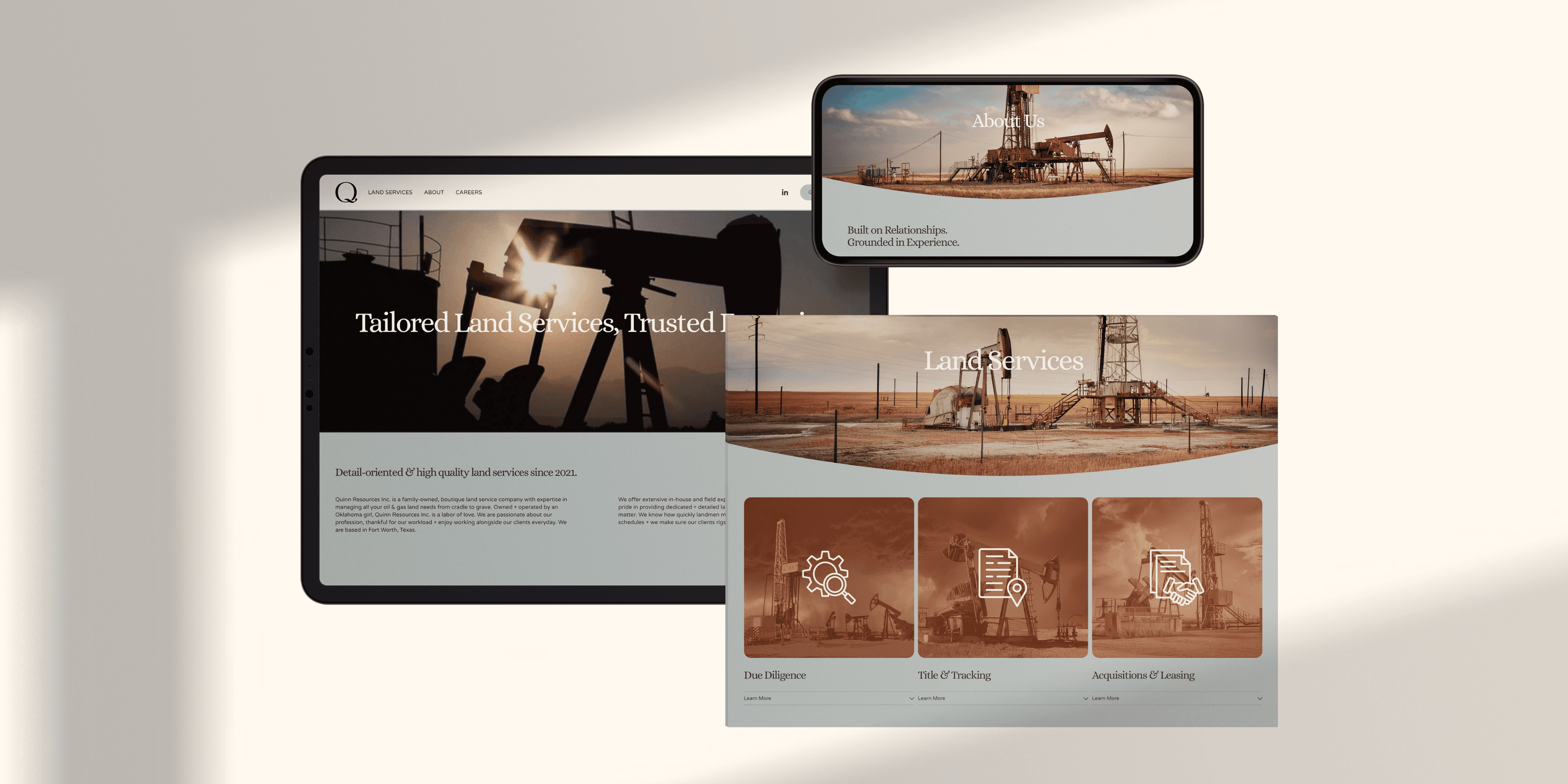
Digital was built to match the firm's posture: quiet, deliberate, and free of the visual clutter that defines most of the category. Restrained layouts, intentional pacing, and clear messaging give Quinn a presence online that mirrors how the team operates in person. No stock imagery of pump jacks. No oversold language. The site is a working tool for the people who actually do business with the firm.
APPLICATIONS
The brand was designed to perform across the materials the business relies on every day. From presentations and reports to digital touchpoints and printed collateral, each application reinforces clarity, hierarchy, and precision. The system adapts seamlessly across formats while maintaining a consistent point of view, ensuring that every interaction feels considered, credible, and aligned with the overall identity.

DIGITAL
The digital system was crafted to capture the brand’s playful energy while creating a seamless and recognizable experience across every touchpoint. Vibrant color combinations, expressive graphics, and flexible layouts work together to create a presence that feels lively, social, and instantly engaging. Whether viewed through web, mobile, or campaign assets, the identity maintains a strong sense of cohesion while allowing the brand’s personality to show up in bold, memorable ways.
THE OUTCOME
Quinn entered the market looking and reading like a firm that had already been operating for years. The system gives the business a credible foundation to grow into — across investor relationships, property acquisitions, and every category-defining moment that follows. In an industry that rarely evolves visually, Quinn launched with a brand that already feels permanent.
THE OUTCOME
The result is a brand that feels distinct without being overstated. By focusing on clarity, restraint, and intention, Gray Capital is positioned with a level of confidence that sets it apart within its category. The system provides a strong foundation for the business to grow while maintaining a consistent and recognizable presence.

“The team at Parachute did truly exceptional work. From start to finish, the process felt thoughtful, efficient, and genuinely collaborative. Early feedback from my investors and network has been outstanding. Everyone keeps saying how sharp and dialed-in it feels.”
“The team at Parachute did truly exceptional work. From start to finish, the process felt thoughtful, efficient, and genuinely collaborative. Early feedback from my investors and network has been outstanding. Everyone keeps saying how sharp and dialed-in it feels.”
Founder & Managing Director, Quinn Resources
Founder & Managing Director, Quinn Resources
THE IDEA
We began by understanding the firm’s principles, its approach to investing, and the expectations of its audience. This revealed a clear gap between the strength of the business and how it was being presented. From there, we defined a brand direction designed to convey trust, clarity, and long-term intent. A modern expression of tradition, built to feel established from day one. Our focus extended beyond identity. We created a cohesive system designed to support digital, physical, and future growth. The result is a brand that communicates quiet confidence and credibility, aligning perception with the firm’s true position.
