THE IDEA
Most personal brands in photography either disappear behind the work or overcompensate with performance. Mary Margaret sat somewhere more interesting. Warm but sharp. Refined without feeling overly polished.
The identity was built to reflect that balance, creating a brand world that feels both deeply personal and creatively ambitious.
Our Role
Brand Strategy
Brand Identity
Digital Experience
Portfolio Positioning
Industry
Creative
MM Photography
Photography portfolios have started to feel increasingly interchangeable. Same layouts. Same muted branding. Same attempt at appearing effortless. Mary Margaret wanted something with more personality, more edge, and a clearer sense of authorship as she expanded into new creative territories. We partnered with her to create a brand identity that feels editorial, confident, and impossible to mistake for anyone else’s.
CASE STUDY
Mary Margaret Photography
Brand Strategy
Brand Identity
Digital Experience
Portfolio Positioning
Creative
Industry
CASE STUDY
Our Role
Photography portfolios have started to feel increasingly interchangeable. Same layouts. Same muted branding. Same attempt at appearing effortless. Mary Margaret wanted something with more personality, more edge, and a clearer sense of authorship as she expanded into new creative territories. We partnered with her to create a brand identity that feels editorial, confident, and impossible to mistake for anyone else’s.

BRAND SYSTEM
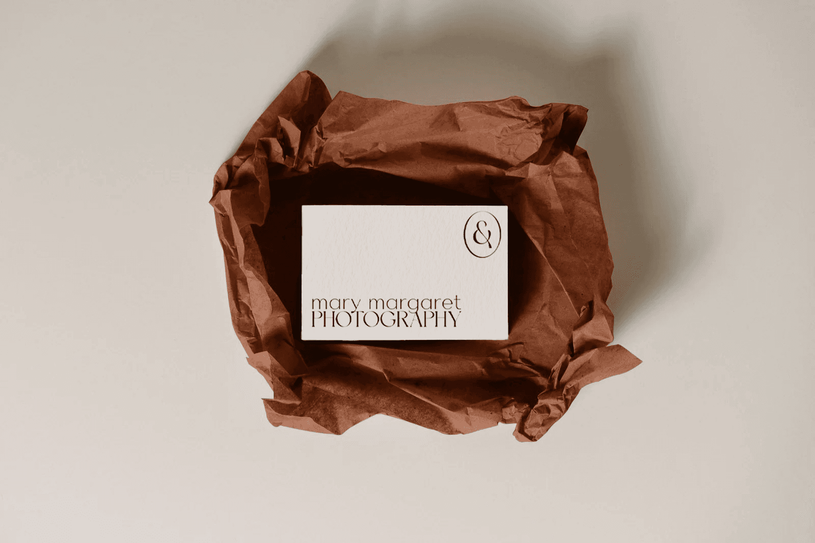
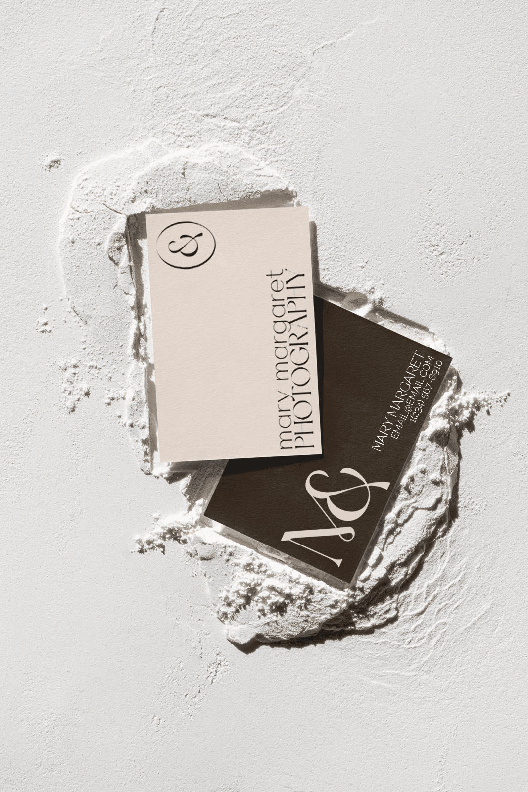
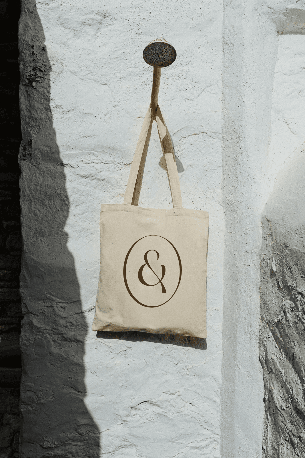
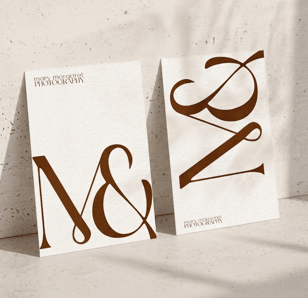
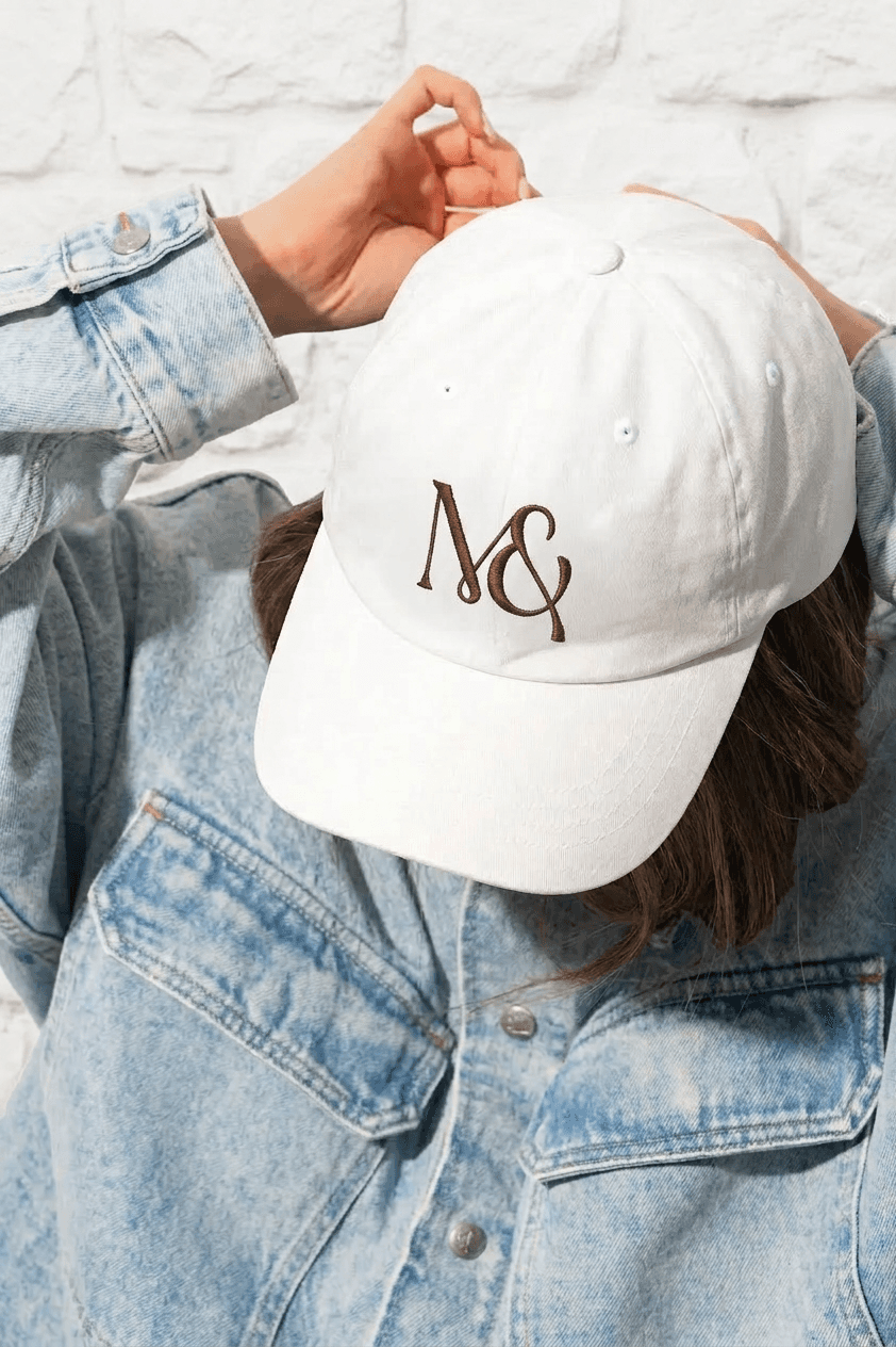
At the center of the system is the “M&” mark, a reference to Mary Margaret’s nickname, her instinct to push beyond “this or that” thinking, and a subtle nod to her last name.
The identity itself leans editorial and understated, allowing the personality behind the work to carry the brand without unnecessary decoration or trend-driven styling.
THE IDEA
Most personal brands in photography either disappear behind the work or overcompensate with performance. Mary Margaret sat somewhere more interesting. Warm but sharp. Refined without feeling overly polished.
The identity was built to reflect that balance, creating a brand world that feels both deeply personal and creatively ambitious.
DIGITAL
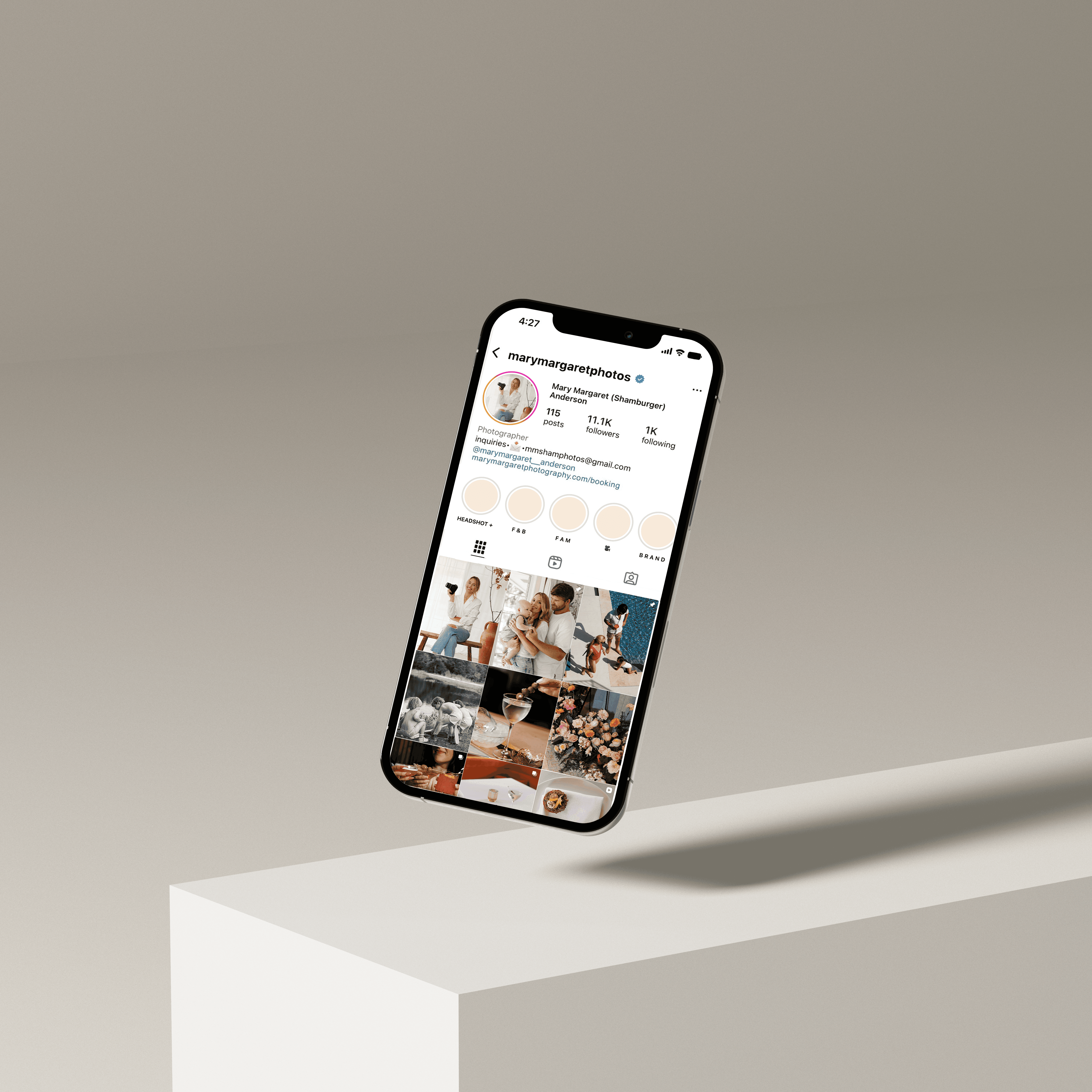
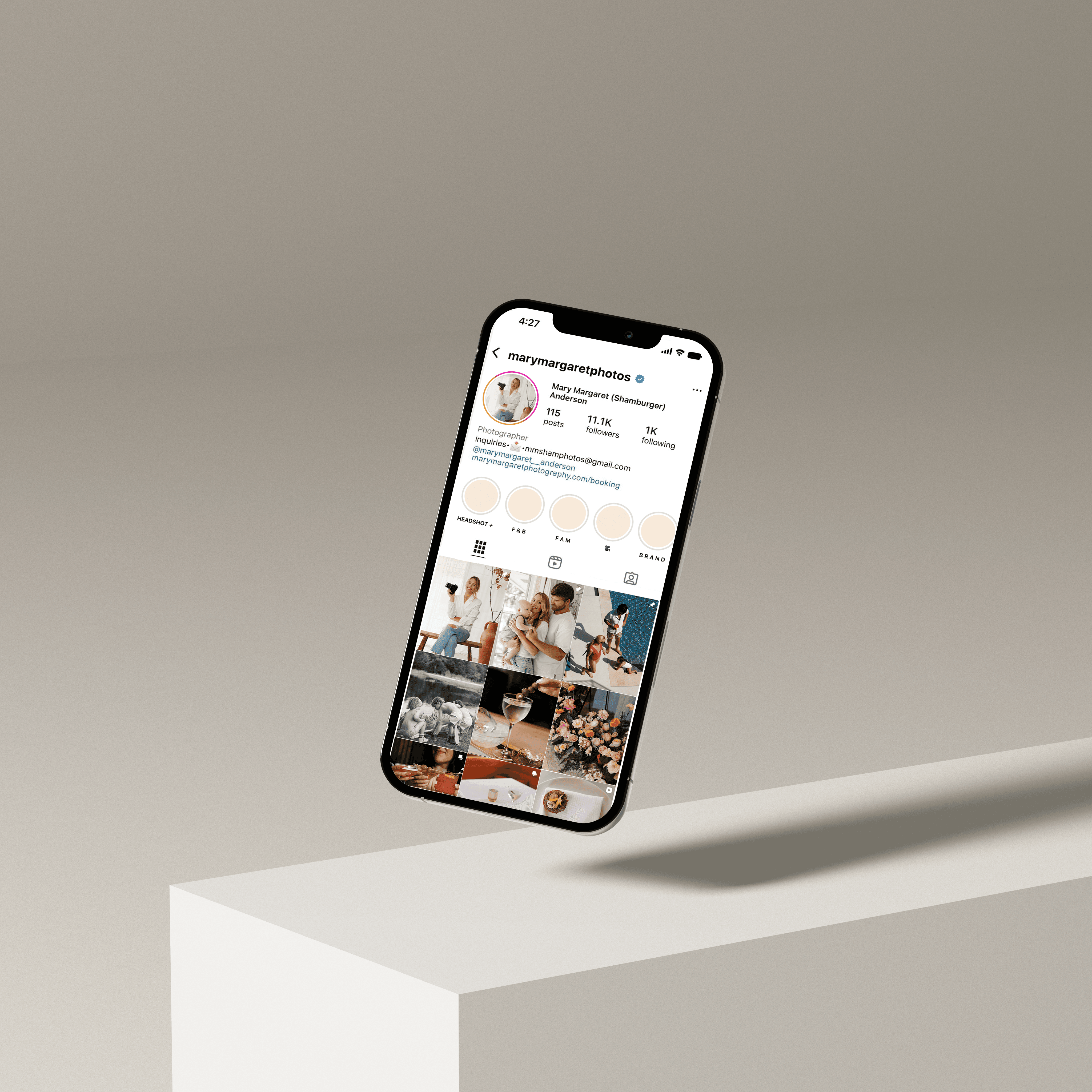
Digital was designed to feel less like a traditional portfolio and more like a living creative point of view. Loose cropping, restrained typography, and thoughtful pacing created a presence that feels curated, personal, and distinctly her own.
BRAND SYSTEM
At the center of the system is the “M&” mark, a reference to Mary Margaret’s nickname, her instinct to push beyond “this or that” thinking, and a subtle nod to her last name.
The identity itself leans editorial and understated, allowing the personality behind the work to carry the brand without unnecessary decoration or trend-driven styling.

THE OUTCOME
Mary Margaret’s brand evolved from a photography business into something with far more range and recognition. The result feels less like a service provider and more like a creative name people actively want attached to projects, brands, and campaigns.
DIGITAL
Digital was designed to feel less like a traditional portfolio and more like a living creative point of view. Loose cropping, restrained typography, and thoughtful pacing created a presence that feels curated, personal, and distinctly her own.
THE OUTCOME
Mary Margaret’s brand evolved from a photography business into something with far more range and recognition. The result feels less like a service provider and more like a creative name people actively want attached to projects, brands, and campaigns.
“Working with Parachute has completely changed the game for my business. From strategy to ongoing support, they’ve helped elevate my brand in ways I honestly couldn’t have done on my own. They are incredibly responsive, creative, organized, and truly care about the success of the people they work with.
As a small business owner juggling a million things at once, having a team I can trust has been invaluable — I genuinely would be lost without them.”
Mary Margaret Anderson
Founder, Mary Margaret Photography
